This user manual gives the required information to create albums with the PhotoSwipe skin. It is not a manual for the viewers of the albums, the user interface of PhotoSwipe albums has been described in a help file for the PC and in another help file for a mobile device.
Note: To run an album made with PhotoSwipe skin version 5 locally on your PC, you have to select on the jAlbum 'Tools / Preferences / General' panel in the 'Preview' group: External browser and check-mark 'Use embedded web server' should be set.
The responsive and mobile-friendly PhotoSwipe skin do give maximum attention to your photos, because they fill your screen with your photo, by adapting the image size to the screen size of your tablet or computer. However you can use it also to embed a light box in a webpage.
The PhotoSwipe skin can play local video files and with the jAlbums Web Locations it is also possible to play videos from the Flickr, the YouTube and the Vimeo site.
To add a web location, open the web page you like to add in your browser and drag the site icon in front of the address of the web page into the jAlbum Explorer window at the place you like to see it in your album.
You can do it too by clicking the right mouse button in the Explorer window and selecting next 'New page' / 'Web location'.
Next enter the URL of the website and click on the Update button. Here is an example of such a YouTube link: https://youtu.be/mzpurct7VZ0 click the update button after you entered this link, the link changes into https://www.youtube.com/watch?v=mzpurct7VZ0&feature=youtu.be . Make a screen picture of the video thumbnail and a enter that as Image URL. Next click the OK button. To get the YouTube video URL, you can also select 'Share' / 'Embed' and copy the src link to the link URL field.
With weblocations you can also display panorama pictures displayed in external viewers. Click here to see an example album.
The PhotoSwipe library has native support for local mp3 videos.YouTube and Vimeo videos should be displayed as web locations. Click here to see the PhotoSwipe video test album, where local videos are started automatically (mostly not possible on mobile devices). Notice the Vimeo URL should start with 'https://player.vimeo.com/' to avoid a "refused to display in a frame because it set 'x-frame-options' to 'sameorigin'" message in the F12 console. It is also possible to display videos from the Flicker site, but for the same reason the video link should start with 'https://embedr.flickr.com/'. You can also first download the corresponding mp4 file and process that file as a native video file.
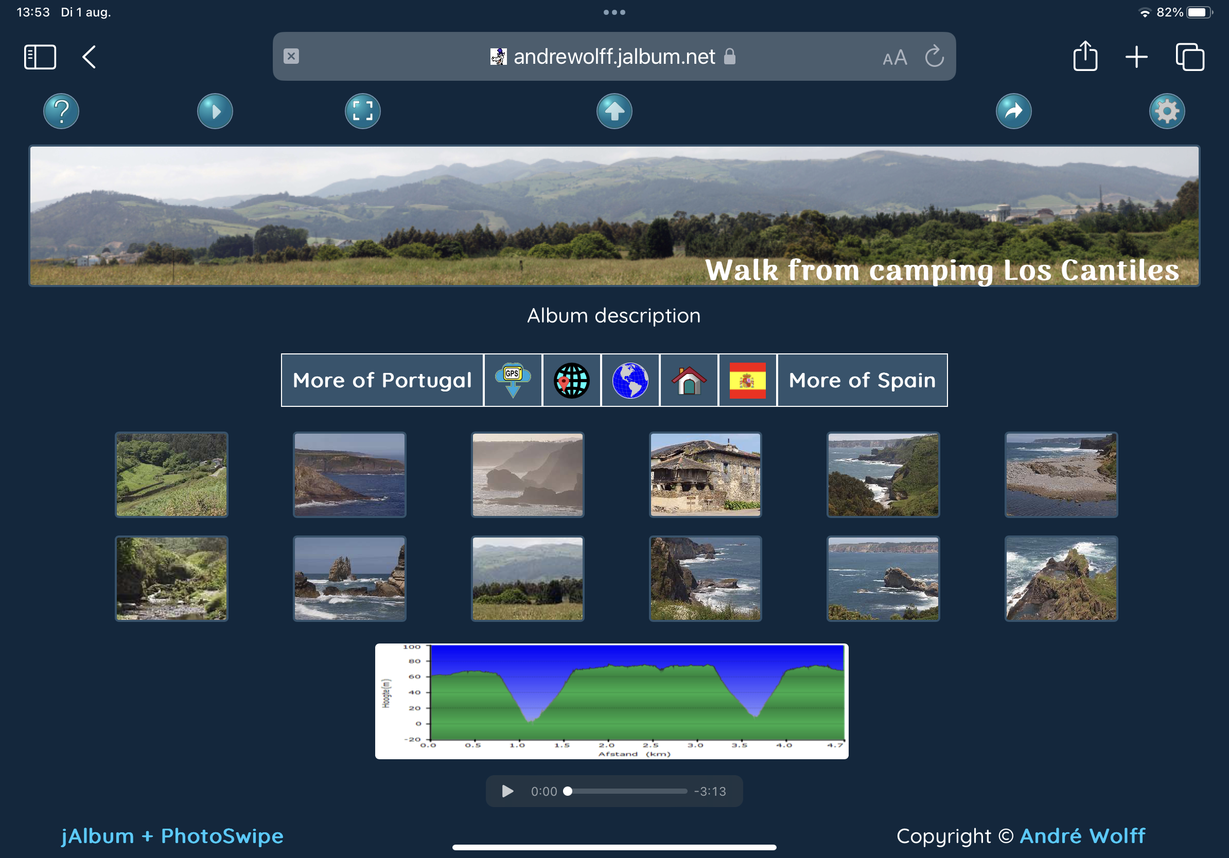
The PhotoSwipe skin has an optional slide show function. The viewer has full control over the slide show via the settings button in the upper right corner of the index page. If you click that button a window opens where you can change the viewing time per slide. You an choose there too to use full-screen for the slide page if it has been supported by the used device.
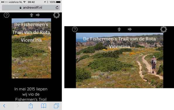
Example of a full index page with music player and with a link to the parent form on an iPad:
You see here an example of an index page with fixed-shape thumbnails and on top colored buttons for Help, Start slide show, Button to go from Full-screen to normal mode, Back to the parent page, Share album function and a button to edit Viewer settings which can be changed by the viewer.
Try it yourself by clicking this link.
It looks about the same on a PC.
If you click the Viewer settings button, or click on a PC the V-key, the viewer settings page opens:
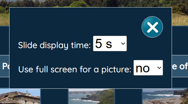
The 'Slide display time' field determines the viewing time per slide if a slide-show is used and with the 'Use full screen for a picture' combo-box you can indicate wheter the light-box should be opened in full-screen mode.
Close this window by clicking the close button in the upper right corner or by clicking somewhere
in the background or on a PC by clicking the V-key again.
Notice here the favicon image entered in the Skins general settings tab.
These settings are saved in the local storage of the browser, so they are used again next time the album is opened and they are used for the other albums made with the same skin.
The buttons and image below the thumbnails on the index page are optional and can be defined by the album creator.
The album creator may also select colored buttons, black or white buttons and text buttons.
Default no file names are displayed below the thumbnails of the index page, but you can see the file name and picture description in the tool-tip if you move the mouse cursor over a thumbnail. On touch screens you see these tool-tips if you tap on a button or thumbnail; to prevent a click action you should move your finger over the screen outside the thumbnail en release there your finger from the screen. (if tool-tips are enabled by the album creator).
If you click on a thumbnail the picture is showed (enlarged in full screen mode if selected by the viewer):

In this example the buttons have a transparency of 0%. The buttons on the slide page are here hidden (always or show the buttons only in the pause state) and navigation via swipes or fast keys. Below you see buttons in the light-box. The functions of the buttons are: Start slide-show, Download image, Zoom, Show Exif-data, Show location, Share image button and the Close button to return to the index page.
If you click the Show Exif data button or the E-key on a PC the camera data are displayed above the slide in a modal window:
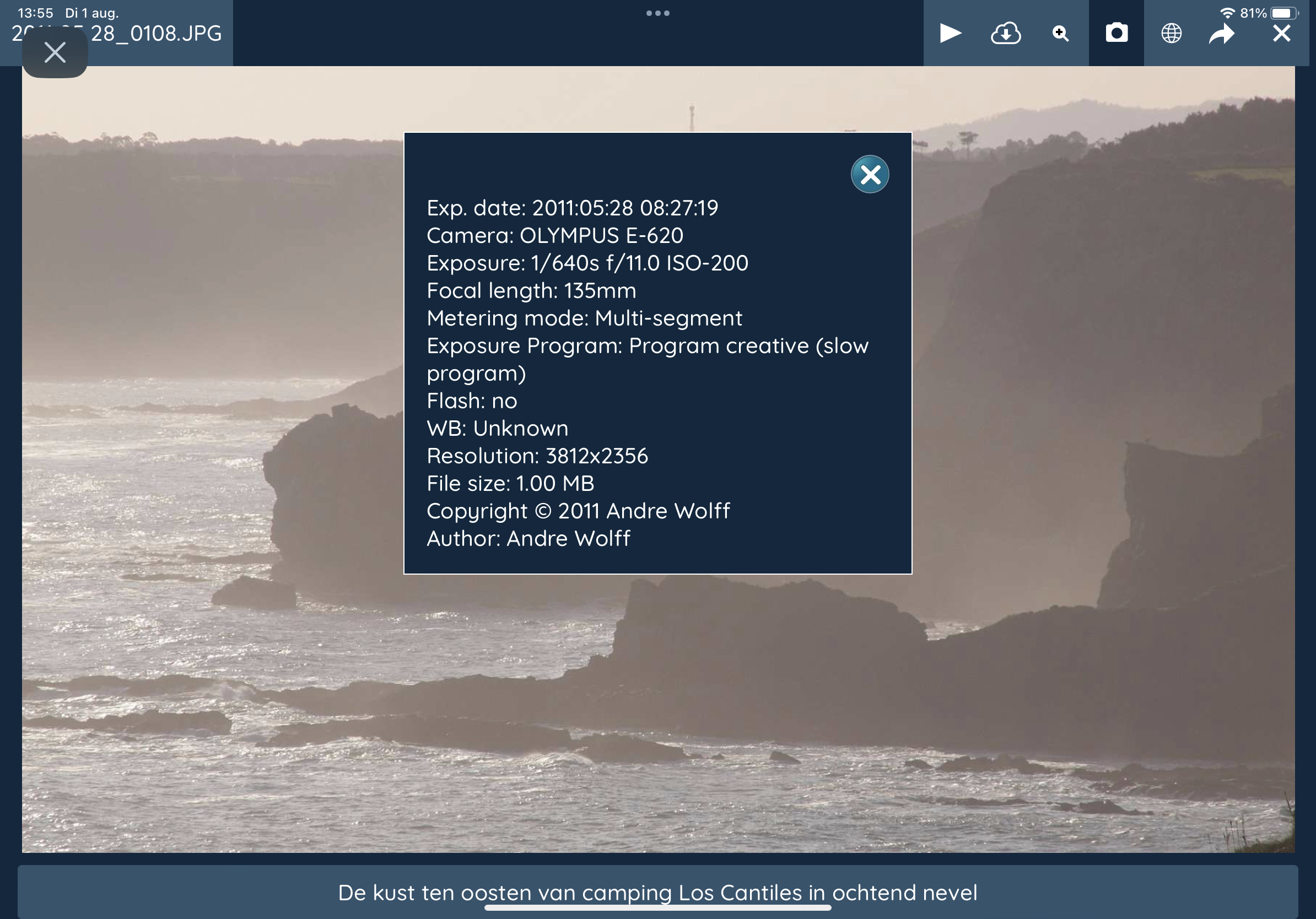
Close the window by clicking somewhere in the background or click again the E-key on a PC.
The layout and appearance of an album is tuned by the album creator in the jAlbum program via the Album / Settings menu:
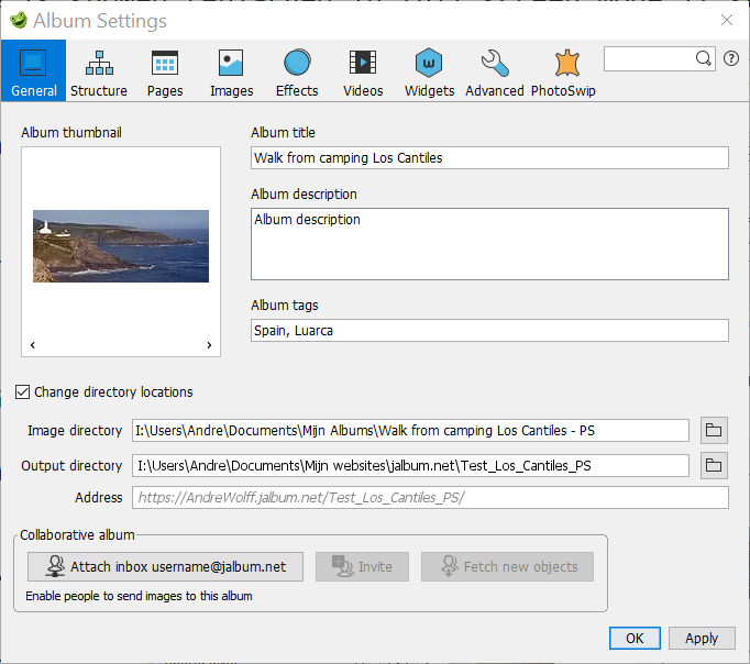
The Album title will be displayed as Title on the index page. After a change of the pictures path, click first the OK button and change next the Album Title and or the Album description otherwise these data are lost.
You can use here HTML code, with or without using the jAlbum HTML editor, see the section How to use HTML code.
If the Album description is not empty, this description will be displayed below or above the pictures on the index page (depending on the contents of check-mark 'Show these links and the album description above the thumbnails on de skin 'Links' settings).
The Album tags are inserted in the meta keywords in the head section of the index html code.
The layout of the index page is determined by the Pages tab:
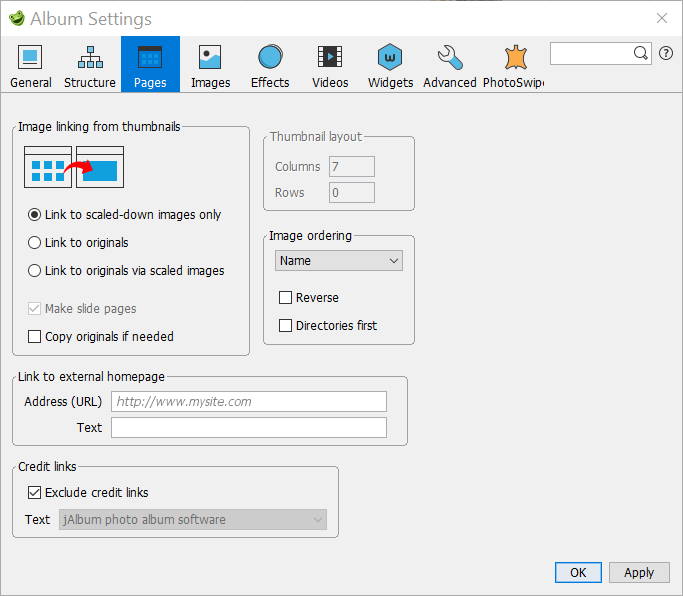
Normally if you saves your images in the camera in JPEG format, you check here the 'Link to scaled-down images only' check-mark, but if you like to offer the possibility to download your photo's in higher resolution, you should check 'Link to originals via scaled images'.
If Slide Page option 'Download button' is checked, a Download button will be added in right corner of the slide. If the user clicks on that button, he can download a copy of the slide image. To download the original image, select option 'Link to originals' or 'Link to originals via scaled images' and check-box 'Copy originals if needed'. The scaled down image used to display the slide is downloaded if 'Link to scaled down images' is selected.
If your camera saves the images in RAW format, which are processed in a RAW image photo editor like Adobe Lightroom, it is better to export your images as JPEG images to the jAlbum images directory and set option 'Link to originals' and set check-box 'Copy originals if needed'. This prevents that the image is converted twice with as result a loss in quality. Export the images in the resolution/size you normally select on the jAlbum Images settings page and don't forget to export also the metadata, because these are processed by jAlbum. For instance I normally select as image bounds for my slide images HD format, 1920x1080. So I use these settings for the export from Lightroom:
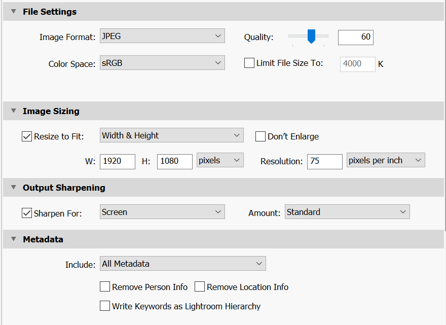
However if you like to make images optimal for retina displays, you should select 3840x2160.
I do export first all images with Width and Weight W 1920 H 1080 and next all the Panoramic pictures again with only a Height H: 1080:
The 'Columns' and 'Rows' fields in the 'Thumbnails layout' group are not used.
You can fill the 'Link to homepage' block, this will generate a text button below the thumbnails on the index page.
The size of the images generated by jAlbum is defined on the Images tab:
Because the slides will fill the whole screen of the monitor / TV or tablet, you should select large dimensions for the images. I select mostly the HD TV resolution 1920x1080 and Quality 60. If you display pictures mostly on an iPad retina screen, you could select 2048 x 1536 or 2048x2048 if you have many pictures in portrait mode. For a 4k monitor you should select minimal 3840x3840 .
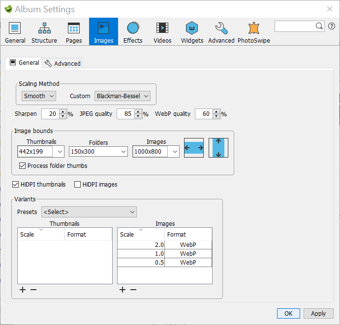
With jAlbum 27 you can generate special folder thumbnail images for use as folder icons.
To use these, you have to set check-mark 'Process folder thumbs' and you should enter the image bounds of the folder thumbnail images in the 'Folders' box (widthxheight in pixels).
This allows you to use much larger folder icons as before version 27 and if you use fixed-shape folder thumbnails
you can use the'Crop focus' function by clicking with the right mouse button on a folder thumbnail and selecting next 'Set crop focus ...'.
The settings shown here are used for the Default jAlbum Sample album
With jAlbum 24 you can use SrcSets. It defines multiple sizes of the same image, allowing the browser to select the appropriate image source for the used device. See the jAlbum blog for more details.
You see in the screen-shot of the jAlbum Images General tab above 4 variants selected, by selecting in the combo-box 'Faster and best quality'.
You can remove settings by selecting a setting and next clicking the '-'button. I always remove the Thumbnails variants, because these are useless I think.
Don't forget to set on the the jAlbum Images Advanced tab to set the Output format to 'JPEG' , for browsers not supporting the WEBP format.
If you open the srcsets sample album,
you see in the captions below the thumbnails which images are generated and if you open a slide page,
you see in the middle of the image which of these images is used on your device.
Notice that panoramic images (see below) are excluded from srcsets.
My IJsland album with folders is made with srcsets and the default jAlbum Sample album is also made with srcsets.
If you hover on a panorama image thumbnail and choose More... and Edit and next open the PhotoSwipe panel on the right, you can set the panorama image settings:
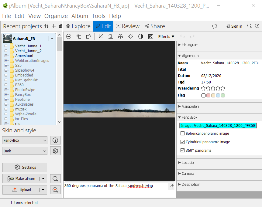
If the album contains cylindrical panorama pictures, an expand icon is automatically added to the slide pages toolbar
if the 'Cylindrical panoramic image' check-mark in the PhotoSwipe panel is set and the
'Don't use Cylindrical Panorama Viewer' check-mark on the Skin settings – Slide page / Options is cleared.
If the 'Spherical panoramic image' is set, the panorama will be displayed in a Spherical Panorama Viewer, if the check-mark
and the 'Use Spherical Panorama Viewer' on the Skin settings – Slide page / Options is set.
By clicking on the expansion button the picture will be enlarged and you can scroll horizontally through the panorama by moving the mouse in the center of the picture, by using the scroll-wheel or on touch devices by moving the image with your finger. To see an album with cylindrical panoramic pictures, click here.
If you set the 'Spherical panoramic image' check-box the panorama will be displayed in the interactive Photo Sphere Viewer created by Jérémy Heleine, if the 'Use Spherical Panorama Viewer' check-mark on the Skin settings – Slide page / Options is set. Click here to see an album made with spherical panoramic pictures. You should only do this if it is horizontally a 360° panorama. In the ideal case the panorama should vertically span an angular range of 180°, so in that case you have an aspect ratio of 2:1. Special 360° cameras, like the Ricoh Theta V, create these images exactly, see the first 3 panorama pictures in the example album.
The new ‘360° image’ panel introduced in jAlbum 14.2 is not used in the PhotoSwipe implementation of the Photo Sphere Viewer, but I recommend to set it because, if that check-mark is set, a spherical panorama image will be scaled down in the slides folder to the nearest power of 2, independent of the selected images bounds on the jAlbum Images / General tab. So a 28000x14000 image will be scaled down to 8193x4096, an image of 5376x2688 will be scaled down to 4096x2048 and an image of 2800x1400 is scaled down to 2048x1024. But this panel is only visible if the image w:h ratio is exactly 2:1.
Note 1: You can't display a spherical panorama locally; you will see a warning message if you try to do this. To prevent this use the embedded webserver on the
'Tools / Preferences/ General'panel'.
Note 2: The size of displayed images should not exceed 8MB, otherwise there is a change that nothing is displayed. So it is not recommended to use the jAlbum page option 'Link to originals' if the original size is > 8 MB.
If you set the 'Cylindrical panoramic image' check-box as is showed in the example, above a user variable maxImageWidth=50000 is automatically applied. If the panorama is made with a normal camera, where the images are stitched by a multi row stitching program like Autopano Pro (no longer for sale) or the Adobe Lightroom program, you can use the cylindrical panoramic viewer, as you can see in this panorama example album.
For a full 360° cylindrical panorama photo, you should also set the '360° panorama' check-box. In that case you can endless scroll through the expanded panorama as you can see in this example. It is also required to set this check-box if your images are exported from a RAW processor and 'Link to originals' is set (so do set in that case also the 'Cylindrical panoramic image' check-box).
It is not recommended to use jAlbums integrated browser if your album contains panoramic pictures, because the integrated browser can't handle large pictures. For the PhotoSwipe skin I recommend to select on the 'Tools / Preferences / General' panel in the 'Preview' group: External browser and check-mark 'Use embedded web server' set.
It is also possible to display a spherical panorama picture with the Marzipano viewer. The 'Cylindrical panoramic image' check-box is not used in that case. Click here to see some examples.
If you hover on a folder thumbnail and choose More... and Edit and next open the PhotoSwipe panel on the right you can enter in a folder album an URL for the 'More info' button and text and/or html code to be inserted after the buttons and before the Profile image:
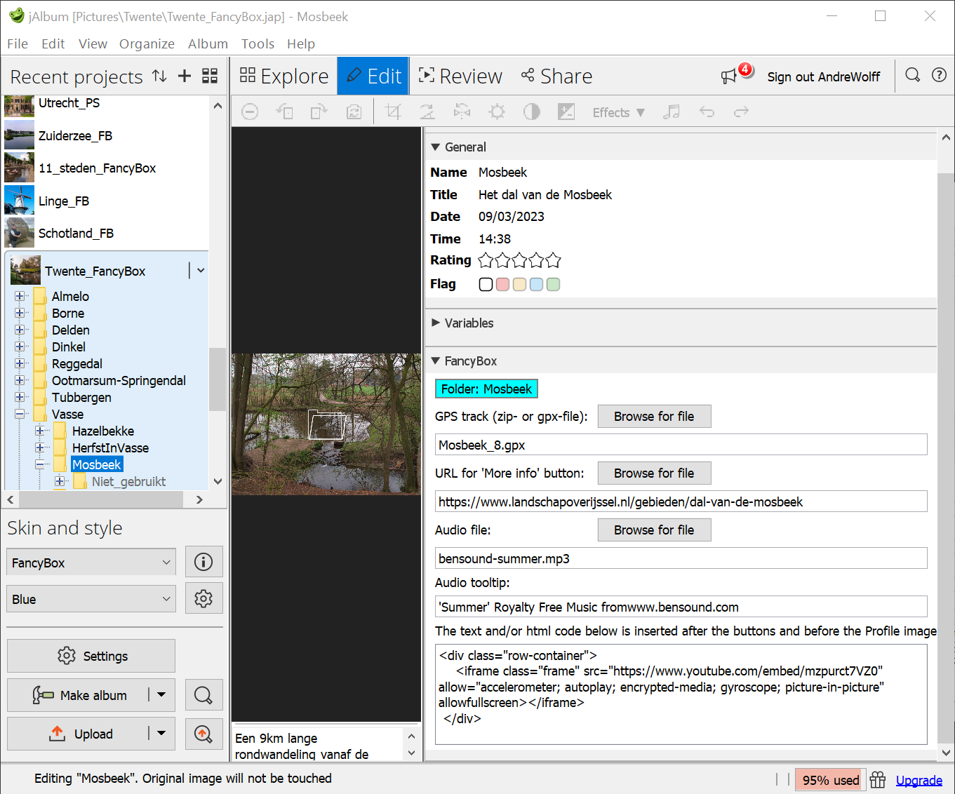
You see here
Notice that if you define a relative link to a file outside the album three, the link may become invalid if you move the output tree to another location.
You see here the recommended code to add a YouTube video in the footer of the index page:
<div class="row-container">
<iframe class="frame" src="https://www.youtube.com/embed/mzpurct7VZ0" allow="accelerometer; autoplay; encrypted-media; gyroscope; picture-in-picture" allowfullscreengt;lt;/iframe>
</div>
To use this, you should enter as extra CSS code in the Custom code tab:
.row-container {
display: flex;
width: 100%
height: 100%;
max-width: 560px;
flex-direction: column;
overflow: hidden;
justify-content: center;
display: inline-block;
overflow: hidden;
}
.frame {
flex-grow: 1;
border: none;
margin: 0;
padding: 0;
}
View the corresponding album by clicking this link.
I never used the jAlbum panel Effects and panel Videos is only important if your album contains also movies. I use the default settings with resolution Original video.
If you like to apply widgets, you should set your wishes on in panel Album Settings – Widgets. The current design in jAlbum is rather old fashioned, so I seldom use it. If you open an album with widgets, it shows a wide line at the bottom of the screen. This line hides sometimes important information, like the description of a slide. Hide in that case the widget by clicking the '-' sign at the right site of the widget line. It is impossible to do this on a small device like an iPhone (see this thread), so that is another reason not to use it.
The Album Settings – Advanced - General panel, is important if you display pictures in subdirectories. In that case you should read my note: How to process pictures in subdirectories in jAlbum with the PhotoSwipe skin.
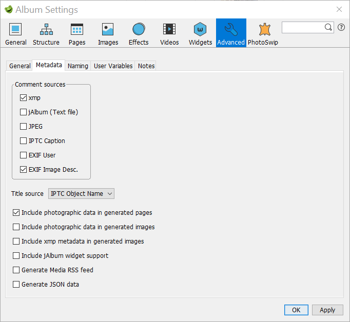
You should select here check-marks 'EXIF Image Desc.' and 'Include photographic data in generated pages' to add descriptions to slides and GPS data to identify the location of the picture. In jAlbum version 14 it is also required to set the xmp check-mark, otherwise special characters like é and © are not correctly displayed.
If you use Face Recognition software like TAGTHATPHOTO which stores the person names in keywords, you should select both the xmp and the IPTC Caption comment source and select the Keywords option for a thumbnail tooltip and / or for the slide description.
I add slide descriptions and GPS location data with my EditPhotoInfo program or with the Adobe Lightroom program.
You can also add this with other programs like Lightroom: enter there the slide description in the Metadata group field Caption. The information entered in field Title is showed in the browser tab field. GPS data can be added in Lightroom module Map.
For a Video you can add a GPS location manually or with a GPS tool or you can add user variable gpsLocation by hand like: gpsLocation=+52.2530,+6.1657 This requires a valid Google Maps API key on the 'Map' tab, unless check-mark 'Use OpenStreeMap' has been selected.
Finally you can enter the slide description in jAlbum: select Explore, click Caption and select the image where you like to enter the slide description. However this works only if you check in the jAlbum Metadata settings check-mark 'jAlbum (Text file)'.
On the Album Settings – Advanced - Naming panel you should set the 'URL-encode links' check-mark to avoid html compliance problems.
If you like to use fancy borders around the thumbnails and or slides, you can use the Album Settings – Advanced - User Variables panel, to enter eXtended Border filters, like you see here. The use of these filters has been described in this note. Don't forget to set all border widths to 0 if you use that. However most effects can be made easier with CSS via settings in the skin pages.
The Skin settings are distributed over a number of pages.
Some of these pages contain text fields for links to other files or web pages on the Internet. You can load these pages with absolute URLs like https://www.andrewolff.nl/FotoSerie/fotoindex.htm but it most times also possible to use relative links with respect to the albums output directory, so links like ../fotoindex.htm . You can do that with the 'Browse for file' buttons behind these link fields. This is only possible if the album has been created. So to use these buttons, create first the album, next fill the link fields and click again on the jAlbum 'Make' button. These relative links do work only correctly if the structure of the folders on the PC is equal to the structure of the folders on the server and you select a folder in this structure.
With the PhotoSwipe skin you see:
The General panel contains settings which are applicable both to the index page and to the slide page.
You can open a slide page embedded in your web page with an iframe from a link on your web page by setting check-mark 'Skip thumbnails pages'. If you like to use the slide show embedded, you should also set check-mark 'Start slide show automatically' on the Skin settings – Slide page / Options tab. Click here to see a description of these techniques and here to see an example. Don't forget to select a transparent background color if you make an embedded album!
If that check-mark is set, the index page is skipped if you open the album. If the Close button is not hidden, clicking the Close button will also skip the index page; instead it opens the link defined at the top of the Links tab.
If the album contains folder albums with index pages which contain only folder thumbnails and no slide page thumbnails, only the underlaying index pages with the slide page thumbnails will be skipped. For an example see the Sample project without thumbnails pages album, The thumbnails index pages are in this case replace by a thumbnails strip on the slide page.
Notice that you should not check the 'Skip thumbnails pages' check-mark if the album contains folder albums, because in that case you can't click on the links to the folder albums!
If check-mark 'Disable Viewer Settings' is set, the default settings cannot be changed by the viewer. It is recommended to set that check-mark for embedded albums to prevent that other settings as the selected defaults for the album are applied.
If you like, you can display the jAlbum widgets at the bottom of the index page to share your album with others or to collect comment to your album. To uses widgets, you have first to select check-mark 'Allow widgets' here and next select what you like to see in a widget in panel Album Settings – Widgets. I don't recommend to used widgets!
Option 'This is an album of albums' requires jAlbum version 14 where the 'Web location' object was added. If set, clicking a thumbnail of a web location on the index page will open the corresponding web-page directly, so the corresponding slide page is skipped, You can use this to make a master album like my PhotoSwipe sample album. Return to the parent album of albums by clicking the up arrow button on top of the child album, to implement this see the Parent page URL field. If the target album/site shown no special return button, you should use the browser return button in the upper left corner of the browser window on a PC. If option 'This is an album of albums' is not set, clicking a thumbnail will open the slide image which corresponds with the web location.
To add a web location, open the web page you like to add in your browser and drag the site icon in front of the address of the web page into the jAlbum explorer window at the place you like to see it in your album. You can do it too by clicking the right mouse button in the Explorer window and selecting next 'New page' / 'Web location'. Next enter the URL of the website and click on the Update button.
Note: It is not recommended to show in an 'album of albums' normal images and weblocations, however if you do so, the weblocations should be the last images in the album, all 'normal' images should precede the weblocations. The panorama viewers do not show next and previous image buttons in an 'album of albums' and navigation buttons in normal slides do skip the weblocations.
If you set the 'Hide menu bar' check-box, the menu bar is hidden. Normally you should keep this check-mark cleared, but you can set if you like to select a template page like the About.htt page via a button or a special menu system as you see for example here. All horizontal menu bars in this example do use the CSS code of the standard PhotoSwipe menu bar, so the appearance is also determined by the menu bar settings on the Skin settings - General tab.
If check-mark 'Use Bootstrap to create menu with background color:' is set, the menu is made with the Bootstrap library. The background color of that menu is determined by the next color selector. See my Greece Islands album for an example of this type of menu.
The combo-box after 'Menu alignment:' defines the alignment of a menu. Select here 'Left', if the drop-down menu of the most right menu item contains wide strings, see as example of such an album my Algarve album.
If check-box 'Fix the menu at the top of the page' is checked, the menu will stay visible if you scroll the index page up. See this example album.
If check-mark 'Replace menu bar by Hamburger button' is cleared, the Hamburger button will never be displayed and if set and the next width field is empty, the Hamburger button will always be displayed. If check-mark 'Replace menu bar by Hamburger button' is set and a width is entered in the next field, the menu will be replaced by a Hamburger button at the indicated view-port width. With the next color selectors you can choose the appearance of the menu and/or buttons tool bar. Click here for an example of a menu bar. With check-mark 'Draw border around menu and/or tool bar item' it is possible to show borders as you can see in this example album. However this is not applicable on a Bootstrap menu.
With a Bootstrap menu, the same colors as used in the Bootstrap menu are used for the Back buttons, in the About and other template files and for the buttons defined in the links tab if no icons are used and buttons are not displayed in a tool-bar.
If you set check-mark 'Disable Right Click and Long Tap context menu, to prevent 'Save as..'' all context menus with items like 'Save picture as ...' and 'View source' are disabled, to make it difficult for a viewer to copy your images.
The size of the font used for the album and slide page description and other text is set in the 'Font-size' selection box. I use normally fonts in the range 16-20 pixels to make the text also readable on a small device like the iPhone.
The Album title size is defined by the 'Album title font-size' selection box. Only applicable if the title displayed is above the theme image or if there is no theme image. If the title is displayed in the theme image, the size is determined on the Index page / Theme image tab,
The size of the text on a button, which defines also the size of the button, is defined after 'Button font-size'. Use a font-size of 20 or more pixels if you like to display your album on a small device like the iPhone.
Selection box 'Thumbnails text font-size' defines the size of the text below or in the thumbnails on the index page and also of the comment below a folder thumbnail in a tile.
If the checkbox "Font-size varies with the window size" is enabled, the text size adapts to the width of the browser window. The selected sizes represent maximum font sizes on large monitors. On tablets and mobile devices, the font size is automatically reduced, but standard text will never be smaller than 16px (8px for thumbs- and button-text).
To see how this works, open this album on a PC, on a tablet and on a mobile phone.
Check check-mark 'Use for the album title Google font:' to use a Google font for the album title. Choose the font you like to use on the Google Fonts page. Copy the name of the selected font to the text-box after the check-mark to use the default style. You can also use a particular style if you indicate that by a thickness and possible Italic parameter after a ':' character. For instance this album uses for the album title Google Font 'Lato:100i' (Lato Thin 100 Italic) and for the other text 'Quicksand:300' (Quicksand Light 300). Click on the '+' button ('Select this font') to see the correct parameters, but don't use a possible '+' character in the name.
For examples see the PhotoSwipe sample album and the albums indicated on that page.
It is also possible to select a normal font for the album title and show available normal fonts by clicking the Font examples link.
With the next check-marks you can also select a Google font for the other texts or use there a normal font.
It is also possible to use Web fonts, this has been described on the jAlbum forum.
Five color fields define the color of the background, the text, the title and the hyper-links text and mouse over color of all pages. For embedded albums it is advised to select a transparent background color; to do that select on the color selector the HSL tab and shift the Transparency slider until transparency 100 is displayed. The system displays 2 squares in the color field if a transparent color has been selected. If you like to copy the used Color Code, select the RGB tab on the color selector and copy the contents of the Color Code field.
The next 2 fields define the optional shadow used around images and controls on the index page. I use mostly a transparency of 60%. See this album for an example of a shadow effect. Fixed shape thumbnails don't show a shadow effect.
The skin contains 5 predefined styles: Black, Custom, Gray, Gray-Textile and White. Use style Custom if you like to define your own colors and/or background image. To change the background image, click on the 'Select button' to select another image for a background and set the 'Auto-size background image with a large background image or set the 'Repeat background image' if you use a small background image. Set check-mark 'Don't scroll background image' if you the background should not scroll. With the combo box after 'Buttons:' you can select the buttons you like to use in your album. You can choose one of the next 5 sets of buttons:
The last group Special buttons contain now round black buttons on a white background which a saved in the skin directory res_Special. If you like to define your own buttons, you should replace the buttons in directory res_Special by svg images of your choice. You should use the same names and make a copy of this directory elsewhere, because the contents of this directory is overwritten if you install a new version.
This is also possible by another way: create in the image directory of your album a directory named 'res' and save there your own buttons using the same names. With this solution you can install a new skin version without problems.
For an album with a dark background, I recommend the set 'White buttons on a transparent background' and for a light background I recommend there the set 'Black buttons on a transparent background'. The next field defines the transparency of the buttons used for navigation, help, settings and user links. The default value for the Transparency is 0%, but you can change this to see the slide partly through the buttons, for an example click here. If you move the mouse over a button, the transparency is temporarily removed.Check-mark 'Use tool-tips with:' allows you to select tool-tips for the thumbnails and the buttons on PCs and on touch screen devices. The next two color selectors makes it possible to choose the text and background color of these tool-tips. You see these tool-tips on a PC if you move the mouse over a button or thumbnail. On touch screens you see these tool-tips if you tap on a button or thumbnail; to prevent a click action you should move your finger over the screen outside the button or thumbnail en release there your finger from the screen.
If check-mark 'Show print button in modal windows' is set a Print button will be showed on most modal windows to print the text in the window.
With the 'Add Google Translate button' check-mark it is possible to add the code required for the automatic translation of the text in an album.
If the next check-mark 'Use default position for this button code: <div id="google_translate_element"></div>' is checked, the language selection combo-box is inserted in the footer section, see this example album.
If that button is not checked, you have to insert at the place you like to see the language selection box
the code <div id="google_translate_element"></div>.
For instance if you like to display this button at the end of a menu, as you see in this album
you have to put the code <div id="google_translate_element"></div> in the first code text box of the
Skin settings – Index page / Folders panel.
The required CSS code for the button should be defined in the CSS code box of the Skin settings – Custom code page, in this example:
#google_translate_element {
margin-top: 6px;
}
You can also display the language selection box in the album description as you see in this example album.
The 'Album language' combo-box allows you to set a different language for the album independent of the jAlbum Preferences language setting. If you select as language 'jAlbun preference', the language set in the jAlbum Tools / Preferences window will be used.
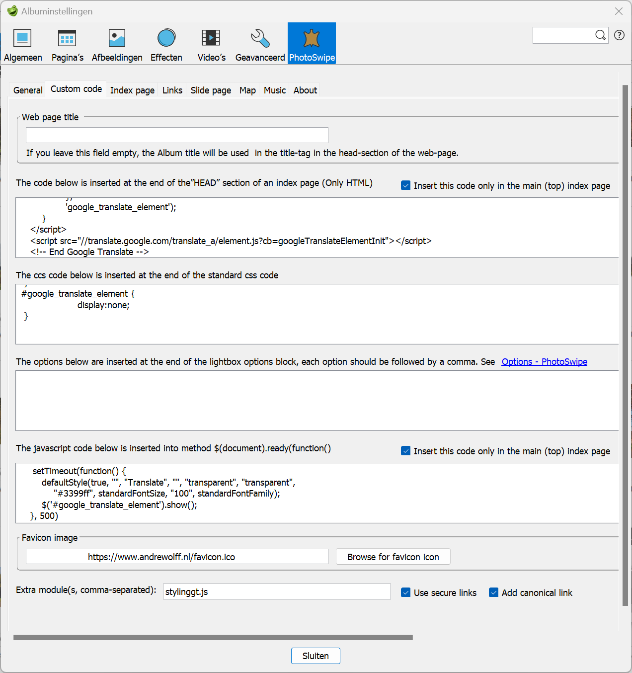
The controls on this tab are used to customize an album with non standard features via extra code.
The contents of the title tag in the head section of the web-page is default filled with the Album title. If that is OK, keep the next field 'Web page title' field empty. However this may not be desired for embedded albums, so in that case you enter here the text for the title tag.
In the next multi-line text box, you can enter optional html code to be inserted in the <head> </head> section of the index file of the main album and the used template files. If check-box 'Insert this code only in the main (top) index' is cleared, this code is also inserted in the folder index files of the album. In the example above you see the code required to initialize the Google Translate function in all files of the album.
If you have skin version 4.3 or later version, the Google Translate function can be added via two check boxes, see here.
In the next text box you can enter your own css code, for instance for the lay-out an extra info window. You see here the code used for the logo button in the menu in this sample album.
In the next text box you can enter your lightbox options which are not used in the PhotSwipe skin or you can overrule the standard option used in the skin. For a description of possible options visit the PhotoSwipe Options page. You see here the code to open a slide image maximal zoomed instead of fit on the page.
In the next multi-line text box, you can enter optional javascript code to be inserted into method $(document).ready(function(). With check-box 'Insert this code only in the main (top) index page' you indicates whether this code should be inserted in the main index page or also in the folder index pages. In this example you see the code to change the styling of a the Google Translate combo-box in the menu of this sample album.
In the Favicon image text box you may enter an URL of your favicon icon, which is showed in the browser tabs in most browsers or select a relative path with the 'Browse for favicon icon' button. If you leave this field empty, the green jAlbum frog will be showed in the tabs for albums hosted on the jAlbum server.
If you want to use a special favicon for a given album, use the Realfavicongenerator.net site to generate a custom set of icons from a PNG (or SVG) file.
Use a PNG (or SVG) file as input, at least 260x260px and click "Select your Favicon image".
Next click the button “Generate your Favicons and HTML code” at the bottom of the page and finally download the package by clicking on the “Favicon package”.
Unzip the downloaded favicon_package_v0.16.zip file and drag and drop the favicon-32x32.png and favicon-16x16.png image files onto the "res" folder in jAlbum in the album's top-level folder. Create the folder "res" if this does not exist yet.
Next enter on the custom code page in field 'Favicon image' res/favicon-32x32.png and on top in the HEAD code field:
<link rel="shortcut icon" href="res/favicon-16x16.png">
Finally Make and Upload the album.
By entering module names in the next text box, it is possible to add extra js code modules at the end of the index page. The js-modules are separated by a comma. Load these modules in the res folder in the image directory. In this example you see how the stylinggt.js module for styling a Google Translate combo-box is added.
Option 'Use secure links' should be set if your album is uploaded to a secure site (starting with 'https:') like the jalbum.net server.
If check-mark "Add canonical link" has been set,
a "canonical" link will be added to avoid the Google Search Console message "Duplicate page without user-selected canonical version".
You get only a link with the correct URL if you Make and Upload the album again after the first Make and Upload.
The settings for the index page are distributed over six tabs:
However the Links tab defines the links which are displayed on the index page.

There are four options to show the top row of buttons above the theme image:
If you select Show initially or Hide initially, the buttons can be hided / showed by clicking in the theme image, or if no theme image is used, on the album title. The last type of selected display is remembered and used in the next index page.
If you always like to hide the help and settings button, check the check-mark 'Disable viewer settings' on the Skin settings – General tab and check-mark 'Show only a help button in the viewer settings window' in this group.
There are three ways to show the album or folder title:
You can also edit the theme image and draw the title in the image, in which case you should select option 'Hide album title'. See here for an example of such an album.
If check-mark 'Show shadow in title above the theme image' has been set, the title text gets a shadow if the title displayed is above the theme image or if there is no theme image.
Check-mark 'Use as background color for the album title:' and the next color selector allows you to give the album title a background color to make it better readable in case a background image is used for the index page.
Check-mark 'Use as background color for the album description:' and the next color selector allows you to give the album description a background color
to make it better readable in case a background image is used for the index page. If the next check-mark 'Fill box around the description' is cleared, the background color area is minimal, just around the text. This works only if no html tags (except <br>) are used.
Set the next check-mark 'Fill box around the description' if you like a to use a larger background color area or if the html-editor is used for the album description and you like to use the selected background color for the album description.
The contents of number box 'Album description box width:' defines the area used to display the album description, This can be an absolute width in pixels or a relative width in % of the window width.
Check-box 'Use left-aligned text (recommended for HTML editor)' is usefully if you use the HTML editor for the description:
The jAlbum HTML editor implemented assumes that the default alignment of text is left-aligned, but the default alignment in the skin is center-aligned. See section How to use HTML code if you like to use HTML code.
As a result, text entered in the HTML editor is shown left-aligned in the HTML editor window, but after you made the album with the new entered text, you see the new text as center-aligned.
You can prevent that by checking this check-mark or by clicking the left-align button in the HTML editor if you start with a new text.
If you set check-mark 'Show shadows on the index page', a shadow defined by the two shadow fields on the General tab will be displayed around the thumbnails, around the theme images and around a buttons-tool-bar (if used).
The group boxes 'Show below or in thumbnail' and 'Show in thumbnail tip' determines possible text for the thumbnails: File name, Title, Comment and only for the PhotoSwipe skin the Exposure date of an image or recording data of an video.
Default no text is displayed below the thumbnails of the index page, but you can see the file name and picture description in the tool-tip if you move the mouse cursor over a thumbnail
or on touch screens you see these tool-tips if you tap on a thumbnail if check-mark 'Enable tool-tip with:' on the General tab is set.
It is recommended to show no text below the thumbnails, however if you check the 'Show file names under thumbnails' and/or 'Show descriptions under thumbnails' check-mark, the file names and/or descriptions will be displayed below the thumbnails.
With the PhotoSwipe skin you can also show the keywords in a thumbnail hint.
We recommend to show image descriptions only on the slide page, because there is more space available for long text. However if you use a search text-box, it is recommended to check also options 'Comment and Keywords in the 'Show in thumbnail tooltip' group. To enter a link in an image description, you could this code: [link text](link URL), but with version 22 or later version, it is better to use the html editor to create a link, so this possibility will be removed in a next version, so this possibility will be removed in a next version.
The thumbnail tooltip is saved in the title attribute of a thumbnail image.
For an efficient search function, the alt attribute text for a thumbnail is made equal to the title attribute text, except if a Justified Gallery caption is requested but not available;
in which case the alt attribute is empty.
If user variable 'alt' is defined, the contents of that variable is used as alt attribute in a thumbnail instead of the title attribute.
With the next 'Allows swipes' combo-box and text box for the mobile device height, it is possible to disable swipes on the index page or allow swipes only on the theme image if the screen width is below a certain value or always if the screen width field is empty. This makes it easier to scroll the index page and use tool-tips on touch screens. I normally restrict swipes on the index page to the theme image, so that it is easier to scroll a page up or down on a touch screen and tool-tips can be used. To prevent that the index page is closed if you scroll through the thumbnails too fast, clear check-mark 'Enable vertical swipes on the index page'.
If check-mark 'Show shadows of panels on the index page' has been set all panels on the index page do get a shadow. If check-boxes 'Use as background color for the album description' and check-box 'Fill box around the description' and check-box 'Show shadows on index page' have been checked, the Album description panel shows also a shadow.
If check-mark 'Show Share window button' is set, the index page shows a Share button to open a modal window with maximal 5 share buttons for WhatsApp, Facebook, Twitter, Pinterest or Email (WhatsApp only on mobile phones). The same window is used in the light-box:
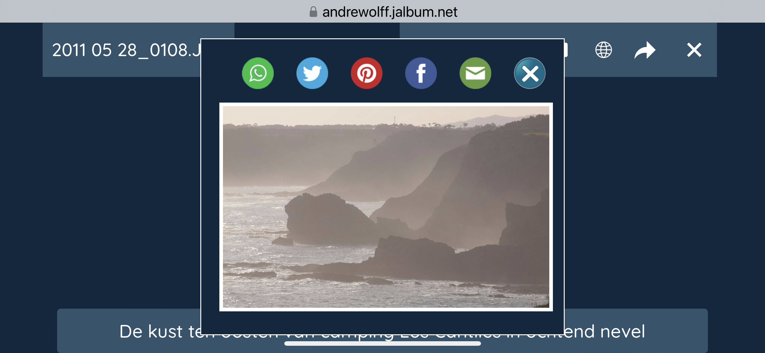
On a PC you can always open and close the share window via the S-key, even if the share button is not visisble. If a viewer clicks the mail-button his mail program will be opened to send the email.
You can define default values for the Addressee, the Subject and the email body text in the 3 text-fields in the 'Email contents' group. The first line of the email body text contains the URL of the album.
You can use this for two purposes:
To share the album or slide page. Leave in that case the Addressee field empty.
To sell a photo or the goods on the photo or to collect comment on your photo. Fill in that case your email address in the Addressee field.
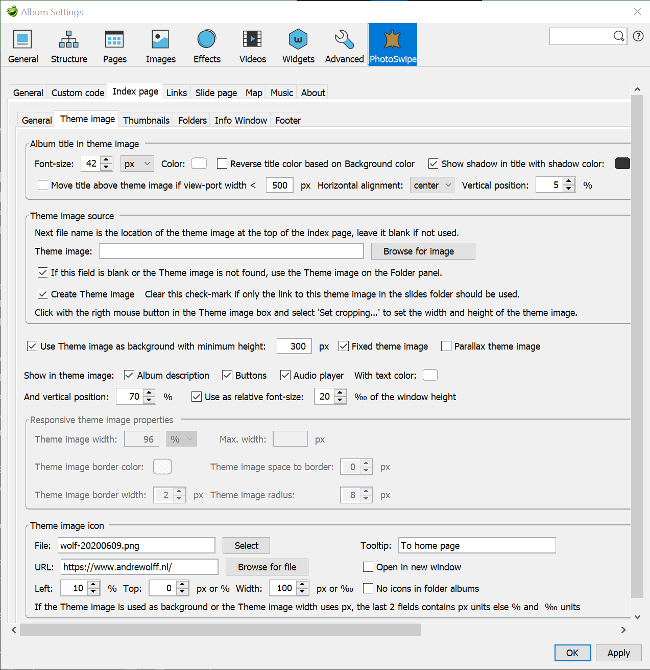
The first group 'Album title in theme image' defines the appearance and position of the title in the theme image.
With the 'Font-size' combo-box you select the size of the title in the theme image. You can use absolute pixel units, recommended for theme images used as background or relative ‰ units recommended for responsive theme images. If you use relative units, the font-size is a ‰ of the view port width, so the title shrinks if the view port shrinks. To see the effect, open this test album on an mobile device and rotate the device or open it on a PC and change the window size. If you select as Font-size unit 'px', the 'Album title font-size' on the Skin settings – General is used.
If you let jAlbum write the album title in the theme image, the title may be unreadable if the Album title text color does not differ much with the colors of your theme image. Select in that case another color with the 'Color' selector on or put the title above the theme image with the 'Show album title' options on the Index page / General tab.
To improve the readability of the title in the theme image, you can also set check-mark 'Reverse title color based on Background color'. See here an example of an album with folders where th ia is used.
Another way to improve the readability of the title in the theme image, is to add a shadow to the title by checking check-mark 'Show shadow in title'. Select the shadow color with the next color selector 'with shadow color'.
The 'Title vertical position' box allows you to shift the vertical position of the top of the Title in the theme image. With combo-box 'Horizontal alignment:' you position the title centered, left or right in the theme image.
Checking the check-box 'Move title above theme image if view-port width <' makes it possible to prevent that the title in the theme image is unreadable in small view-ports. Notice that in that case the title font-size, the color and the shadow is defined on the General tab and the Index page / General tab
The second group 'Theme image source' defines the appearance and position of the title in the theme image. The are 4 ways to generate a theme image
If method 1 is used, methods 3 and 4 are ignored and if method 3 or 4 is used, the use of include file page-header_2.inc is excluded.
You can display the theme image as a background image with a constant height or as a responsive image which adapts his size to the size of the window. On large displays there is not much difference between the two methods (Click here to open an album with a theme image used as background image and click here to open an album with a theme image used as responsive image), but on small devices like an iPhone the difference is significant as you can see in the next screen-dumps.

The first two screen dumps show a theme image used as background image on an iPhone.
The next two screen dumps show the same theme image used as responsive image, but with a font-size in pixels.
You see that long titles are sometimes not showed correctly on small devices like an iPhone in portrait mode. Set in that case the check-box 'Move title above theme image if view-port width< 500px'.
The last two screen dumps show the same theme image used as responsive image, but with a relative font-size in ‰, you see that the title shrinks if the window shrinks..
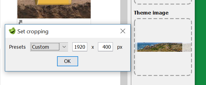
You can display the theme image as a background image with a constant height and a width almost equal to the window width. To select this, set check-mark ‘Use Theme image as background ..’ and enter the required height in the next text-box. If theme image folderimage.jpg is created, you can leave this field empty: the height is copied from the theme image height field of the 'Set cropping' window. However you can still enter a height smaller as the cropping height is you want a smaller background theme image.
There are 3 types of background theme images:
By checking one of more of the next three check-boxes, it is possible to display the album description and / or the link-buttons and / or the audio controller in all types of Theme images. If one or more check-boxes is set, they have priority over the "Show these links and the album description above the thumbnails" on the Links tab and "Show audio player above the thumbnails" on the Music tab.
The text inserted in the theme image is styled with the next 4 controls:
These items can be displayed both in theme images made of responsive images, see this example and in theme images used as background images, see the examples above.
If check-mark ‘Use Theme image as background ..’ is cleared, the theme image is displayed as a normal image, with the properties set in the next 'Responsive theme image properties' group.
In field 'Theme image width' you enter the display width of the theme image. We recommend to use a width in %, so that the theme image is scaled if the window size is changed. This makes also the album responsive, the width is adapted to the screen width, so the album looks the same on an iPhone and on a big monitor.
However, the width of the theme image is never larger then the natural width of the theme image.
I use always 96%. If you apply shadows around the theme image, you should always 96%, otherwise you see a ghost shadow.
If you enter a value like 600px, the width is fixed and the size of the image is not changed if the window size changes.
If you enter the size in %, you can limit the size of the theme image on large screens by entering a maximum size in pixels in the next field 'Max-width'.
With the next 4 fields you can design a border around the theme image. With a 'Space to border' value > 0, you will see the background color or page background image between the border and the theme image (or thumbnails).
I use mostly wide panoramic theme images so that there is sufficient room for the normal thumbnails on a small device. I use the theme image in that case as swipe area (see 'Allows swipes' field above).
The note 'How to implement albums with a theme image with the PhotoSwipe skin' describes the whole procedure and gives an example of a theme image that is processed in a photo edit program like Photoshop Elements, where we cropped the image and added text in the image.
The last group 'Theme image icon' makes it possible to show an icon or logo image on top of the theme image. This is only possible with the PhotoSwipe skin. To use this, you should select the image to be used in the 'File' field. You can use jpeg-, png-, gif- and svg-files as logo or icon. Enter an explaining text in the 'tool-tip' field.
You can connect a link to this image if you enter the link in the 'URL' field. If you do this, the theme image icon will only be displayed in case of a valid link. As an example open this folder album and select the Vila Nova sub-album, you see there the Info icon. But in the next sub-album Porte Covo, you see no Info icon, because the info page MoreInfo.html is missing in the corresponding sub-directory. The position of the icon in the theme image is defined by the fields 'Left', the distance in % from the left side of the index page and 'Top', the distance to the top of the theme image. To allow you to use this icon as a logo, the size of the icon is differently from a normal link icon, it is determined by the contents of the field 'Width'. The natural width of the icon should be equal or larger than the contents of that field. If the Theme image is not used as background and the Theme image width is defined as %, the Theme image top and width fields contains ‰ units else pixel units. In this album with a theme image as background image (see the settings above), you see such an icon in the upper left corner, in this folder album you see such an icon in the middle and in this album you see the icon in the lower right corner of the theme image. The last two albums show the theme image as a responsive image.
If you like to see the icon only on the top level index page, set check-box 'No icons in folder albums'.
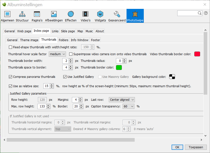
If the Justified gallery is selected you see:
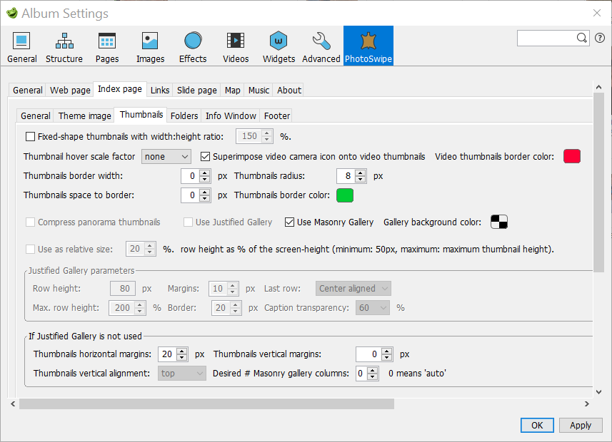
If the Masonry gallery is selected you see:
If a gallery with fixed-shaped thumbnails is selected you see:
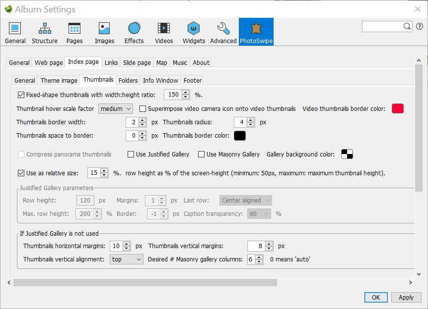
The PhotoSwipe skins supports the ‘Justified Gallery’, the 'Masonry Gallery' or a Variable # thumbnails / row (Check-boxes 'Use Justified Gallery' and 'Use Masonry Gallery' both cleared).
If you check the check-mark 'Fixed-shape thumbnails', all thumbnails do get the same size. The height is defined by the 2nd number of the
jAlbum settings – Images panel - Thumbnails field in field Image bounds /Thumbnails group. The width is calculated with the width:height ratio given after the 'Fixed-shape thumbnails' check-mark.
It is recommended to use fixed-shape thumbnails only if both the ‘Use Justified Gallery’, and the 'Use Masonry Gallery' check-boxes are cleared.
The next 7 fields are used for all three gallery types:
With 'Thumbnail hover scale factor' combo-box it is possible to enlarge a thumbnail automatically a bit if you move the mouse above a thumbnail.
If you set check mark 'Superimpose video camera icon onto video thumbnails' a small camera icon will be shown in the upper right corner of a video thumbnail.
If you set this check mark, you should clear the corresponding check mark on the jAlbum Images / Advanced tab. The jAlbum overlay icon is too large for small icons like 120x80 which I normally use.
Note: if you set or clear check mark 'Superimpose play icon onto video thumbnails' on the jAlbum Images / Advanced tab, a 'Force Remake' is required to see an effect!
You can put a border around the thumbnails by entering the width in field 'Thumbnails border width'; the color of the border is defined after 'Thumbnail border color:' a thumbnail of a video and of a folder gets his own border color.
You can insert space between the border and the image by entering a value > 0 in field 'Thumbnails space to border'.
If you like rounded corners, enter a value > 0 in 'Thumbnails radius'.
If option 'Compress panorama thumbnails' is checked, the width/height ratio of a panorama photo thumbnail is limited to 2.2, so part of the left and right side is omitted.
With option ‘Use Justified Gallery’ the number of thumbnails on a row will be reduced if the screen width is reduced,
but all thumbnails on a row do get the same height and all rows except mostly the last row will get the same length.
This gallery type is in particular suited for landscape photos, see here
for an example (This albums uses thumbnails with borders, the used parameters are displayed in the screen dump above).
Details of the Justified Gallery parameters are documented in the Justified Gallery documentation.
The ‘Row height’ defines the average height of a row. Parameter 'Max. row height' (in %) is used to calculate the maximum row height.
If you select 100%, all rows will get the same height, but images can be cropped. Select a higher value to prevent that.
This gallery type is well suited if the width of your images varies a lot, for instance if you display also wide panoramic pictures. I use mostly non-fixed shape wide thumbnails, for instance 800x160 where the 'Row height' is a bit smaller as the selected thumbnails height.
The 'Margins' defines the gap between the thumbnails. The color of these gaps is defined by the 'Gallery background color'. The default color is transparent, in which case the color of the gaps is equal to the index page color.
The 'Border' defines the outer border of the gallery, if the value is -1 the outer border will be made equal to the Margins.
We recommend to use the value 20 to prevent the 'jump content' problem on a PC.
To avoid this problem, it is advised to use a transparent 'Gallery background color' and a border of 20.
If you select in 'Show below or in thumbnail' on the Index / General tab the option 'Comment', you will see the caption of the image in the thumbnail if you move the mouse cursor over the thumbnail. Select with 'Caption transparency' the type of caption you like to see if the mouse is not over the thumbnail. Select a value < 80% if you wish to see the captions on mobile devices.
The 'Last row' parameter defines the layout of the last row. If you select 'Justify' the length of the last row will be made equal to the length of the other rows, but the row height can considerable be enlarged if the last row contains only 3 or less thumbnails. I prefer mostly 'Center aligned', in which case the height of the last row is equal to the height of the other rows.
If you like to draw borders around the thumbnails of a Justified Gallery, you should select as 'Thumbnail border width' a number unequal to 0. The color selected in field 'Thumbnail border color' will be used for the border.
Next you see check-mark 'Use as row height: ' followed by '% of the screen-height (minimum: 50px, maximum: maximum thumbnail height)'. If this is selected, the 'Row height' field is disabled. The maximum row height is determined by the height value in the jAlbum settings tab 'Images / General' field 'Images bounds / Thumbnails'. Compare the display of the thumbnails of this album on a large monitor and a mobile phone to see the effect. These settings are not used with the Mansonry gallery. These two controls are also used for the thumbnail height of a Masonry-Gallery or for a Grid-Galery (both check-marks 'Use Justified Gallery' and 'Use Masonry Gallery' cleared). It is recommended to use this if you have large thumbnails and still like to show these on small devices like smart phones. But remember the size of a thumbnails can never be larger as the maximum size set in Album Settings – Images field 'Images bounds / Thumbnails'.
With a Masonry-layout,
the thumbnails are displayed in a number of columns, the width of a column is determined by the thumbnail with the largest width
and the number of columns is determined by the value of spinner Field 'Desired # Masonry gallery columns'.
If you select the value 0, the recommended value, the number of columns is automatically adapted to the available space:
it drops automatically for small screens and small view-ports.
This type of Gallery is not suited for wide (panorama-) pictures, but it is very well suited for portraits,
for examples see this album of people where the # columns are automatically adapted to the available space
and this album with 4 fixed columns.
It is advised to use the Masonry-layout only if you have 7 images or more, because the thumbnails are not centered if you see only one row of images.
Both the horizontal and vertical gap between the boxes in a Masonry gallery is determined by the 'Thumbnails horizontal margins', so you can make the 'Thumbnails horizon margins' 0, unless you like a larger vertical gap between the boxes. If the Masonry gallery has been selected, the setting of check-mark 'Compress panorama thumbnails' is ignored, panorama thumbnails are never compressed in this case.
You have to play a little with the various settings to get the Masonry layout you like!
Panel 'If Justified Gallery is not used' defines the parameters in case the Justified gallery is not used, so with the Masonry gallery or a Variable # thumbnails gallery.
The distance between thumbnails is defined by the fields 'Thumbnails horizontal margins' and 'Thumbnails vertical margins'. If you like to get no or a very small distance between the thumbnails of a grid gallery, you should enter a negative number (-2,-4), the value depends also on the border width. If you apply a shadow effect, the value should exceed the shadow width defined on the General tab. Negative numbers are not supported for the Masonry gallery.
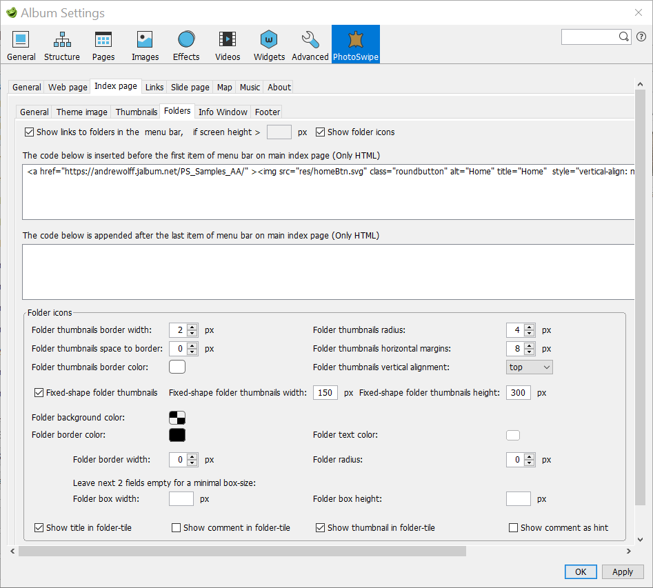
If the album contains folders and you set check-mark 'Show links to folders in the menu bar', the links to the folders will (also) be displayed at the top of the index page. Click here for an example. Because a menu bar with links to folders can take a lot of space on a small device like an iPhone, you can hide the folders in the menu bar by entering a minimum screen height after 'if screen height > '. You can only fill a value in this field if no Hamburger button is used, so if on the General tab, check-mark 'Replace menu by Hamburger button' has been cleared. For each folder album you can display a thumbnail if you set check-box 'Show folder icons'. If you use already a folder menu at the top of the index page, you may decide to clear this check-box.
With the next two multi-line text boxes, you can enter optional html code to be inserted at the start of the menu or appended at the end of the menu. The code you see above implements the extra items in this sample album: a logo and a translate combo box to translate the text in another language. You can also use it to add a search box as you see in this album.
The next 'Folder icons' group define the display of thumbnails which are links to folder albums. This is a box with a folder thumbnail (indicated by a read heart in the folder) or a folder image with the folder title below this image, see this example.
The box width and/or height for a folder image and its title can be set by the user by entering a value in field 'Folder box width' and 'Height' fields. In most cases you should leave these fields empty: the box size corresponds in that case as close as possible to the folder image size.
Finally there are four check marks to show/hide the title text, the comment text and the thumbnail on a folder tile or show comment as a hint.
With the PhotoSwipe skin it is possible to use different properties for the slide thumbnails and the folder thumbnails. You see there 7 extra fields for the folder thumbnails:
It is possible to select the vertical alignment of the folder thumbnails with the combo-box 'Folder thumbnails vertical alignment', but you see this only if no fixed-shape thumbnails are used and the Folder box height is undefined (empty).
By checking the 'Fixed-shape folder thumbnails' check-box, it is possible to use fixed-shape folder thumbnails, with the size defined in the next two fields (for jAlbum version 26 or older) or in the mage bounds for folder in the Album Settings – Images tab (for jAlbum version 27 or newer).
With jAlbum version 27 or later version the last two field are not displayed because you should set the size as image bounds for folders in the Album Settings – Images tab. Values set in previous versions are now copied to the Folders bound field on the jAlbum image tab if check-mark 'Process folder thumbs' is cleared.
If you have an older jAlbum version, it is recommended to define no size which is much larger as the thumbnails Image bounds defined on the Album Settings – Images tab, because no new thumbnails of that size are created.
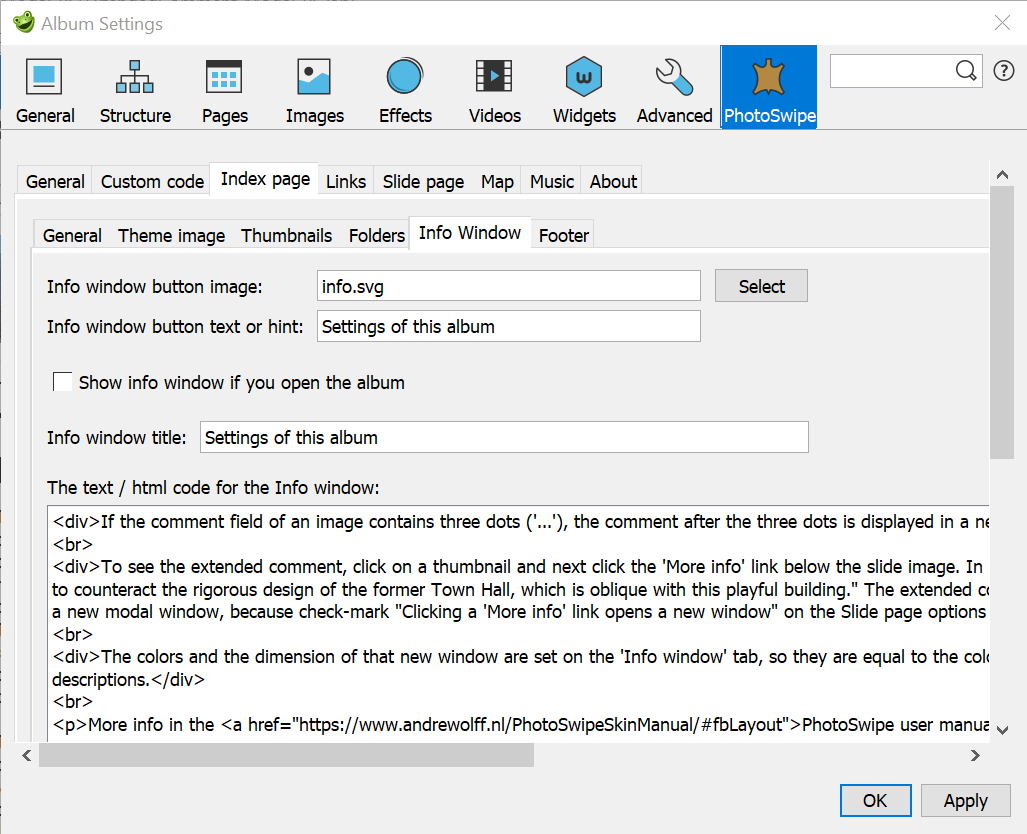
You can display a modal Info window, see this sample album for an example.
You can use an image to open the extra page. Field 'Info window button image' should in that case show the name of the image selected via the Select button. You should select an image with a dimension of about 50x50 pixels. This icon will be displayed between the other buttons defined lower, between links 5 and 6. The text in the next field 'Info window button text or hint' is used as hint message. If the 'Info window button image' is empty, you will see a button with the text given in field 'Info window button text or hint'. You should fill at least one of these two fields, otherwise you will see not button or icon to click on. In this sample album it is the 3th button from the right.
This modal window uses the 'Page background color' and 'Text color' defined on the Skin settings – General tab. If check-mark 'Show print button' on that tab is set a Print button will be showed, to print the text in the window. On a PC you can use the I-key to open and close this modal window. For an example see the 'More info''windows in this album (click on the 'Recept >>' link).
If you set check-mark 'Show info window if you open the album' this window is showed if you open the album, see here for an example. However you should not set this check-mark in case the album contains sub-albums in folders, because in that case you see the info window again if you return to the parent page from a sub-album.
If you like to give the Info window a title, enter the title in the 'Info window title' text-box. Leave it empty if no title is required.
In 'The text / html code for the Info window' you enter the contents of the extra info window. If this text field contains no <p> or <br> or any other html-tag, the line-feeds will automatically be replaced by html new-line tags (<br>).
If you enter here html code (see also what has been said for How to use HTML code), you can enter the required css code in the css block of the
Skin settings - Custom code tab. You see there the css code used for
this sample album.
You can also use a pdf-file as info window.
You make such an info window as follows:
Put the pdf-file (indicated below as your_pdf_file.pdf) in the output directory. Open the Index page / Info window tab and set the window width to 90% and the height to 100%. Enter in the text / html code box: <iframe src="your_pdf_file.pdf" style="height:720px;width:100%;" > </iframe > Because a long pdf-file is not always readable to the end on an iOS device like an iPad, enter in the 'Info window title' field next text to make a link: [Open in new window](your_pdf_file.pdf)
Set check-box 'Show info window if you open the album' and / or file the fields 'Info window button image' and ''Info window button text or hint'.
You can make a back-up of the extra files in the output directory in a folder named out in the corresponding image folder. Create such a folder, exclude the folder in the jAlbum Explorer and copy all the extra files to this folder. If an album is made, these extra files are automatically copied to the output directory if these files are not already in the output directory.
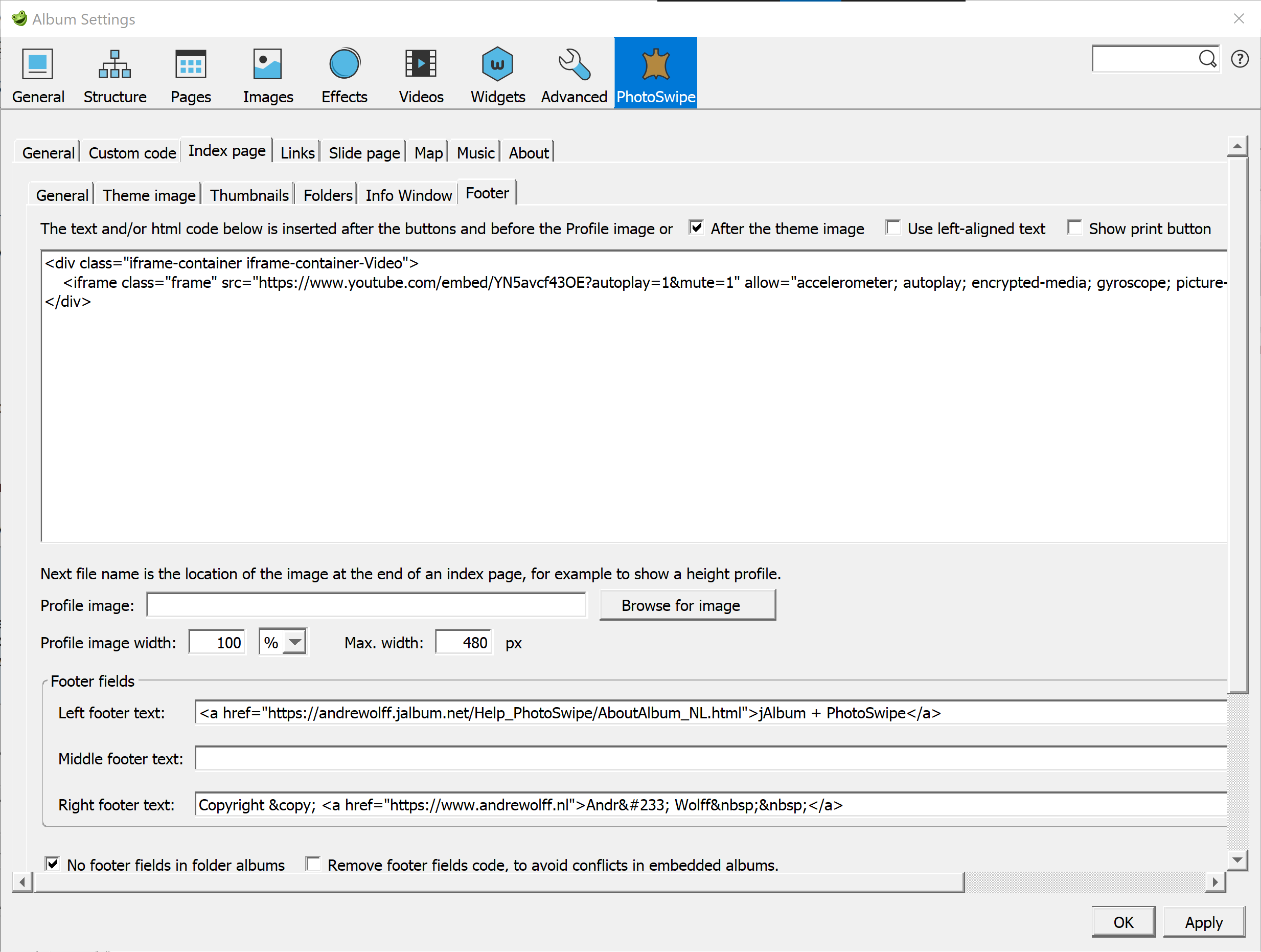
The HTML or text code in the first text box allows you to insert a block html code or normal text below the thumbnails, just above the footer text boxes.
If check-mark 'After the theme image' is set, the code is inserted after the theme image. You can use this for instance to replace the theme image by a video or slide-show as has been described in my blog.
It is centered aligned text, unless you use an html tag to change this or you set check-box 'Use left-aligned text'.At the end of the index page you can show a special image for instance to show the profile of a GPS track, see this example album, but you can use that image for other purposes, like your logo, as well. Put that image also in the output directory and enter the file name in field 'Profile image'. If the Profile image ends with '.', the next file extensions are checked: first 'png', next 'gif' and finally 'jpg', only lower case extensions are supported in this construction.
In field 'Profile image width' you enter the display width of the image. You can enter a width in % so that the image is scaled if the window size is changed. This makes also the album responsive, the width is adapted to the screen width, so the album looks the same on an iPhone and on a big monitor. I use for a height profile mostly 480px. If you enter nothing the natural width of the image is used. If you enter a value in the next 'Max. width' field, the image will never get a width larger as the entered value. It is recommended to enter here always a value if a % profile width is used, to prevent that you get too large images on large displays. See as example the height profiles of my gpx walking's in my Algarve album.
You can make a back-up of the extra files in the output directory in a folder named out in the corresponding image folder. Create such a folder, exclude the folder in the jAlbum Explorer and copy all the extra files to this folder. If an album is made, these extra files are automatically copied to the output directory if these files are not already in the output directory.
The contents of the fields 'Left footer text' , 'Middle footer text' and 'Right footer text' are displayed at the bottom of the index page. If the 'Left footer text' box is empty, a link to jAlbum and the PhotoSwipe skin will be shown in the footer. In all the fields described here and in the description of an album, you can use jAlbum variables like ${currentDate} as you see here in the'Middle footer text' field.
If you don't want this link, just enter a space in the in the 'Left footer text' box.
To enter a link in a footer field, you could use this code: [link text](link URL), but with version 22 or later version, it is better to use the html editor to create a link, so this possibility will be removed in a next version. Instead of a text, it is also possible to show a small image in a link, as is done in the 'Middle footer text' field above..
To show an image without a link, just enter the image URL in angle brackets like: <img src="wolf.png" > (save image wolf.png in that case in the output directory with a backup in an excluded out folder), but you can use the above described 'Profile image' field for the same purpose.
If you like to see the footer fields only at the top album in an album with folder albums, set check-mark 'No footer fields in folder albums'.
Set check-mark 'Remove footer fields code, to avoid conflicts in embedded albums.' in case you see problems in embedded albums which use also footer CSS-code.
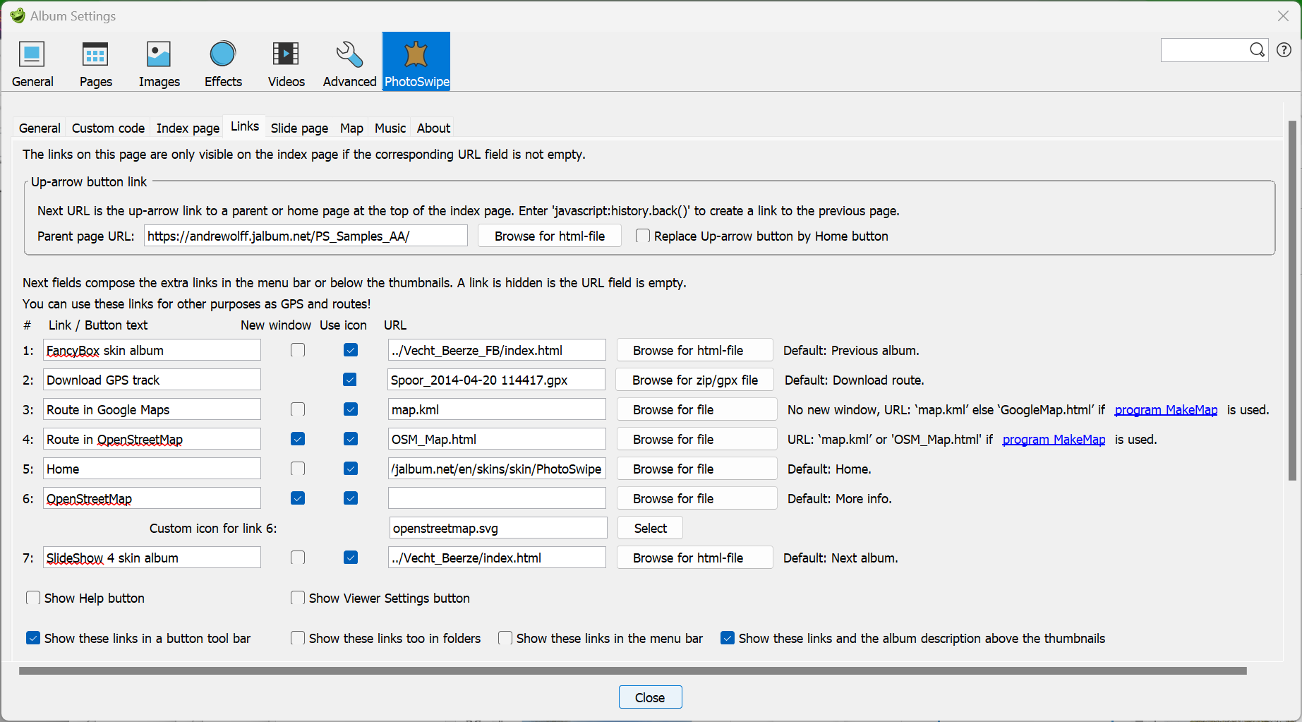
The Links tab defines all hyper-links on the index page. For all these links apply the rule: if the URL field of the link is empty, the link is invisible.
The controls in the 'Up-arrow button link' panel allows you to use an up-arrow button at the top of the index page.
The 'Parent page URL' link defines a link to another page via an up-arrow icon on the top of the root index page. If this field is empty no up-arrow icon will be visible except in a folder album. By entering 'javascript:history.back()' in the Parent page URL field you can return to the previous page, however in case of an album with folders it is better to enter an absolute address like 'https://andrewolff.jalbum.net/FB_Samples_AA/' or a relative address like '../menu.html' if your album folder is in the same directory as file menu.html, but if your album is one level deeper the relative address is '../../menu.html'. Normally you use only the 'Parent page URL' field to define the link to the page which did open this index page. However if you build a tree of albums and this is a descendant album from which, after it closes, should give the focus back to the open top index page, you should give a relative path like '../index.html' to the top parent page. Click here for an example of such a tree of windows. You will see that the settings selected by the viewer in the parent page, are copied to the child pages. However it is also possible to process folders in the standard jAlbum way, see here the same folders processed as one project. For more info read my note 'How to process pictures in subdirectories in jAlbum with the FancyBox, the Slide Show 4 or the PhotoSwipe skin'.
If you set check-mark 'Replace Up-arrow button by Home button' the Home button instead of the Up-arrow button will by showed at the top of the page.
If an album contains folder albums, the thumbnail folder icons are displayed in a second table of thumbnail folder icons after the slide picture thumbnails of the top album. However it is the responsibility of the album creator that the folders are located after all normal images in the jAlbum Explore. If not all folders are behind the images in the jAlbum Explorer, a yellow notification will be displayes and the console window shows a message for folders with folders before or in between images.
The 7 lines below the 2 panels define the display of optional hyperlinks in the index page. A link will only be shown if the corresponding URL field contains a text. You can use the 'Browse ..' buttons to compose relative links to files in the output directory tree. Notice that in case you define a relative link to a file outside the album three, the link may become invalid if you move the output tree to another location.
The link will be opened in a new window if the check mark 'New window' is set, otherwise the index page will be replaced by the new page.
A link can be displayed as a button or as an icon, depending on the check mark in the 'Use icon' column. The text on the button is equal to the text entered in the button text field in front of the URL field. The size of the text, which defines also the size of the button, is defined on the 'General' tab after 'Button font-size'. Use a font-size of 28 or more pixels if you like to display your album on a small device like the iPhone. I recommend to check-mark 'Show these links in a button tool-bar', in which case no text buttons are showed and the standard font is used. If icons are used, the contents of the button text fields are used as hint message if you move with the mouse pointer over the icon.
The first and last link are default the links to preceding and following albums. Clicking the left/right button of the keyboard or giving a left/right swipe will activate these buttons. If one of these two buttons is clicked or activated and the 'New window' check-mark is not checked, the current index page is closed and replaced by the page at the URL address.
The second link is used to download a file. As default it is used to download a GPS track in a ZIP- or GPX-file. You have to save the download file in the root-output folder of the album. You can browse to ZIP- and GPX-files, but you can enter also other file types like TXT- and PDF-files.
Links 3 and 4 are default used to show the track and/or locations of the photos in Google Maps or Google Earth (see also this note and the help file of my program MakeMap), but you are free to connect other functions to all buttons. The Google Maps button is activated by the down arrow key on the keyboard.
If no new window is selected for the Google Maps route link 3 and a kml or kmz file is entered in the URL field, the map will be displayed in a section of the index page like the map for a slide location and a panorama expansion page. So background music is not stopped, but if a html file is entered, the index file is replaced by the html file and the background music stops if no new window is selected. No Track download button is showed if the track-log file does not exist in the output directory. No Google Maps button is showed if the corresponding relative html, kml or kmz file does not exist. No Google Earth button is showed if the corresponding relative kml or kmz file does not exist. These links buttons are always showed if an absolute URL (starting with http or mailto) is used.
Program MakeMap allows you too to display the route in OpenStreetMap via a web-page 'OSM_Map.html'. Select that file in the URL field of link 4, check check-mark 'New window' and change the Link / Button text in Route in OpenStreetMap. In that case no Google Earth globe icon will be showed but the OpenStreetMap icon (openstreetmap.svg).Link 5 is default used to display a Home button and link 6 is normally used to display a 'More info' link, but as you see here, it can also be used for other type of links. For link 6 you can use your own custom svg-icon file. To use your own icons, create a res directory in the root image directory and save your own icon files in that directory. If you enter in this res-directory other representations of the standard button icons (prevAlbum.svg, download.svg, google-maps.svg, google-earth.png, openstreetmap.svg, home.svg, info.svg and nextAlbum.svg) these icons will be displayed instead of the standard icons.
You can make a back-up of the extra files in the output directory in a folder named out in the corresponding image folder. Create such a folder, exclude the folder in the jAlbum Explorer and copy all the extra files to this folder. If an album is made, these extra files are automatically copied to the output directory if these files are not already in the output directory.
If you choose to connect an other function to a button, you probably should not check the 'Use icon' check-mark, because the icon will probably not show the correct symbol for the new function (unless you enter in the res-directory in the image directory another representations of the standard button with the same filename). There are two buttons where you may chose your own custom icon: the icon of the extra page button and the icon of link 6. Select the image for link 6 with the Select button below the URL field. If the corresponding field is empty, the standard 'More Info' image will be used.
You can use this field to implement a mail button with the mail.png button ion the res folder:
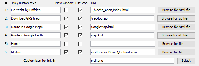
The URL field 6 should start with 'mailto:' followed by your email address.
Each link will be activated with a fast key:
The next two buttons "Show Help button" and "Show Viewer Settings button", can be used if no top-buttons are used on the index page ('Show never' selected in the 'Top row of buttons' group on Skin settings – Index page / General).
It is also possible to use a javascript function in the 7 URL fields on the Links tab. You can use that to add navigation buttons in an album with folders:
You can combine icons and buttons, but in that case it is advised to set the next check-mark:
If you set next check-mark 'Show these links in a button tool bar', you will see these links in a tool-bar with colors and appearance defined on the 'General' tab.
If you set check-mark 'Show these links too in folders', you will see these links also on the index pages of folder albums.
With include file buttons.inc you can make more buttons, see Include files.
If you set check-mark 'Show these links in the menu bar', you will see these links in the menu bar at the top of the index page, the links are in that case text links and these links are not shown as buttons elsewhere on the index page, also not if next check-mark is set.
Normally these links and the album description is showed below the thumbnails on the index page, but if you set check-mark 'Show these links and the album description above the thumbnails', you will see these links below the theme image, see here for an example.
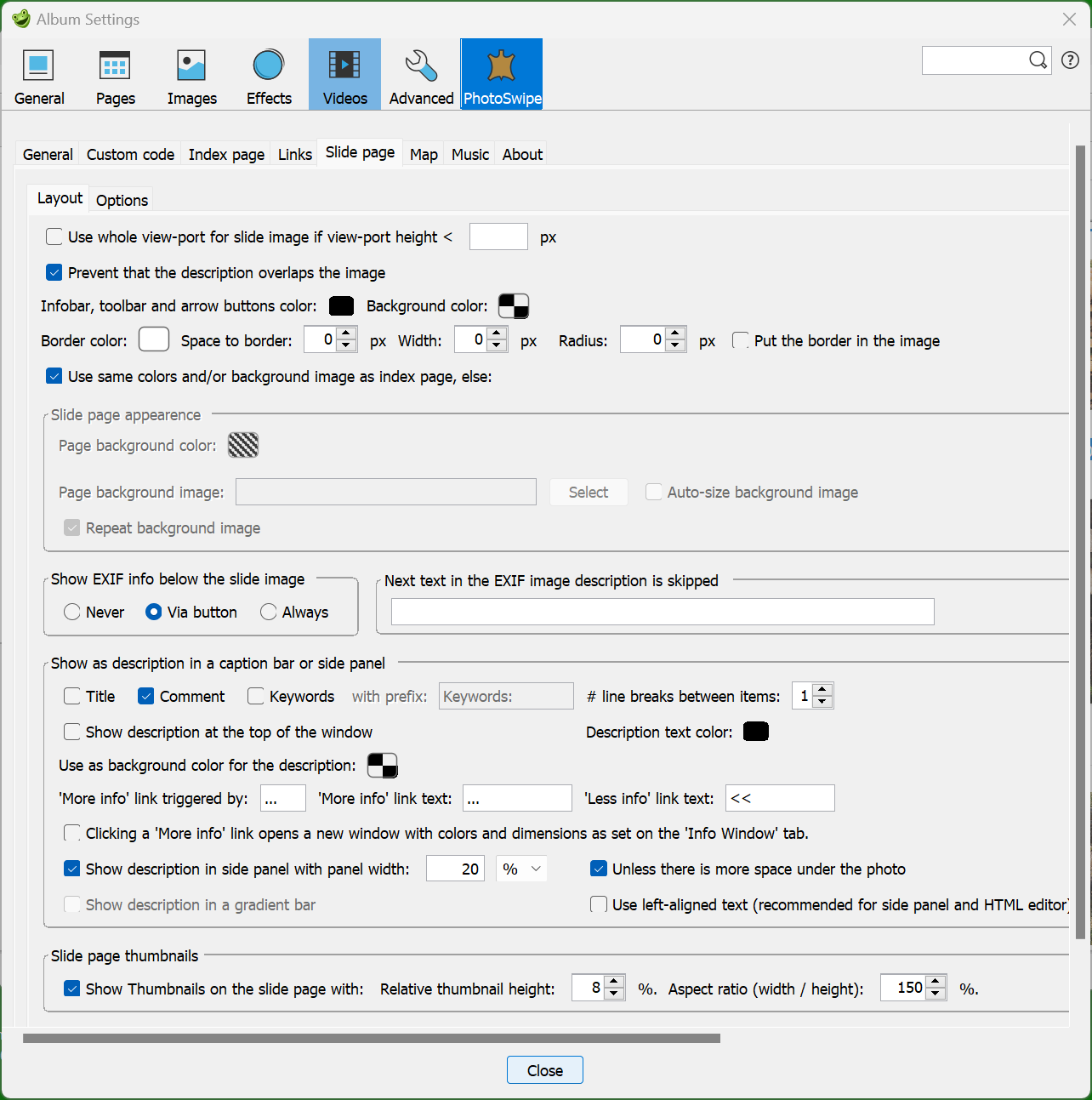
Check-box 'Use whole view-port for slide image if view-port height <' allows you to use the whole vertical internal height of a window for the slide image. If you enter a value for the minimum view-port height after this check-mark, it is only applied for small devices with a view-port height below the given value. So I see it only on my iPhone if I enter a minimum view-port height of 400 px. If you leave that field empty it is applied on every device. If this check-mark has been set, the toolbar and possible info in the upper left corner will not overlap the image.
If you set check-mark 'Prevent that the description overlaps the image', the description will never be displayed in the image. Depending on the setting of this check-mark, some fields in the 'Show as description in a caption bar or side panel' are enabled or disabled. For instance a description in the side panel is only possible if this check-mark is checked.
If you use descriptions for mp3-videos, YouTube videos or Vimeo videos you should clear both check-marks, otherwise are these captions not visible. To get full access to YouTube or Vimeo controls, you should set check-mark 'Show description at the top of the window', but if the controls are not accessable, you can always start or stop the video by clicking on the video.
With the 'Infobar, toolbar and arrow buttons color:' selector you can define the color of the text in the infobar, the color of the toolbar buttons and the color the navigation arrow buttons.
With the next 'Background color selector you define the background color of the text in the infobar, the background color of the toolbar buttons and the background color the navigation arrow buttons.
The 'Caption bar and side panel color:' color selector is used to define the background color of these two areas. I use here many times a full 100% transparent color to view the text above the slide page background as you see in this example.
The next 4 fields are used to make a border around the slide page image: Border color, Space to border, border width and border radius are defined in these 4 fields. With check-mark 'Put the border in the image' you can choose an implementation via XBorderFilter or via CSS. The XBorderFilter makes the border in the JPEG file itself, so if you change a border parameter, all images will be made and uploaded again, which can be a problem for large albums. You should also not use the XBorderFilter if you use 360° or spherical panoramas. The only advantage of the XBorderFilter is that you don't see a thick border for a moment if you open the light-box., see this example album.
If the next check-mark 'Use same colors and/or background image as index page' is cleared, it is possible to define the colors in the 'Slide page appearance' group. This group contains the same controls as already discussed on the Skin settings - General tab.
The group 'Show EXIF info below the slide image' allows you to show Exif information below the photo description.
The image description is ignored if it is fetched from the EXIF data and it is equal to the contents of the next corresponding field. I do this because my camera manufacturer puts automatically the text “OLYMPUS DIGITAL CAMERA” in the EXIF remark field which I use to describe my picture. I do not like to see that text in my album if I did not give a description.
In the 'Show as description in a caption bar or side panel' group you can select the items you like to see displayed for a slide image. If you select more as one item, the items are separated by the selected number of line breaks. Titles are displayed in bold and keywords are displayed with a prefix indicated in the text field next to the Keywords option (leave that field empty if you don't like to see a prefix text).
If faces have been identified, for example by program Tag That Photo, then the names of the identified persons can be displayed as keywords under the enlarged photo on the slide page. In the Tag That Photo program settings you should select Write keywords, in the skin settings Slide show / Layout tab you must check the Keywords option and on the jAlbum Advanced / Metadata tab you must check the xmp and ITPC options.
The same is possible with the Lightroom program if the persons are added automatically or by hand as keywords.
The default way of showing descriptions is below the image, but if you have only short descriptions it is also possible to show these above the image by setting check-mark 'Show descriptions at the top of the window', but this works only only if check-mark 'Prevent that the description overlaps the image' is cleared.
If you use descriptions for YouTube or Vimeo video's, it is recommended to check this check-mark, so that the controls below the video's are not hidden by the description.
You can set here also the text foreground color used for the description with color selector 'Description text color:'.
Color selector 'Use as background color for the description:' allows you to select a (semi-transparent) background color for the description text. If you use descriptions for YouTube or Vimeo video's, it is recommended to choose here a transpareny of 100%, so that the controls below the video's are not hidden by the empty area left and right of the dsciption.
It is possible to define the 'More info' link trigger (default '...'), the 'More info' text (default '...') and the 'Less info' text (default '<<'). Click-able area of the link enlarged.
All text behind '''More info' link triggered by:' text (default '...'), in a comment is displayed if you click on the 'More info' text (default '...') at the end of the initially displayed description, see here for an example album. Clicking the 'Less info' text (default '<<') will remove again the extended text.
The 'More info' link trigger '...' should not be inserted in a html-block. This is the recommended construction:
Library ...The architect has tried to counteract the rigorous design
Next constructions are also correct:
<h1>Library</h1> ...<p style="text-align: left;">The architect has tried to counteract the rigorous design
<p style="text-align: center;">Library</p> ...<p style="text-align: left;">The architect has tried to counteract the rigorous design
But this is incorrect:
<h1>Library ...</h1>The architect has tried to counteract the rigorous design
If you set check-mark 'Clicking a 'More info' link opens in a new window, the extended text is displayed in a new modal window as you can see in this example album. This modal window uses the 'Page background color' and 'Text color' defined on the Skin settings – General tab. If check-mark 'Show print button' on that tab is set a Print button will be showed, to print the text in the window. On a PC you can use the M-key to open and close the More info modal window.
If you don't want to use 'More info' links, clear text field ''More info' link triggered by:' or use the html code … instead.
It is also possible to show extended descriptions on a side panel with the check-mark and width text box: 'Show description in side panel with panel width:' in the same group. See this example of a slide page with a side panel. The width of the side panel can be defined as % or as px. The text is left aligned. If check-mark 'Show description in side panel..' is checked, the Exif data are also left aligned displayed in that side panel. No panel is displayed if the caption is empty, however if Exif data are displayed via the Exif button, the side panel is also visible if the description is empty.
If check-mark 'Unless there is more space under the photo' is set, the description will automatically be positioned the below or aside the image, depending on the available space. See this example album.
If you set check-mark 'Show description in a gradient bar', a gradient caption bar is used. See here for an example. This check-mark can only be set if check-mark 'Prevent that the description overlaps the image' is cleared.
Default the description text is center-aligned, but if check-box 'Use left-aligned text (recommended for HTML editor)' is set, the description will left aligned.
The jAlbum HTML editor assumes that the default alignment of text is left-aligned. As a result, text entered in the HTML editor is shown left-aligned in the editor window,
but after you made the album with the new entered text, you see the new text as center-aligned.
You can prevent that by checking this check-mark or by clicking the left-align button in the HTML editor if you start with a new text.
If you like to use centered text in the side panel, enter this css-code in the css code box on the Custom code tab:
.pswp__dynamic-caption--aside {
text-align: center;
}
By setting check-mark 'Show Thumbnails on the slide page with:', in the 'Slide pages thumbnails' group, you can display the thumbnails at the bottom of the slide page. The size of these thumbnails are determined by the next two fields.
The currently displayed image is displayed with a border in the thumbnails strip. You can click on another thumbnail to open the corresponding image in the light-box. Scroll vertically through the thumbnails if there is no room for all thumbnails in the displayed row.
If there is not sufficient free space available below the slide image, the thumbnails strip may overlap the image and/or description of the image. However the tool-bar contains a button to hide or show the thumbnails strip, so by clicking on that icon, you can toggle the display of the thumbnails to reveal the description.
Use the settings shown in the screen shot above to get a maximum of free space.
So clear the check-marks 'Show description in gradient bar' and 'Use whole view-port …' and set check-mark 'Prevent that the description overlaps the image'.
To prevent that you get small portrait type of slide images on a smart-phone in landscape mode if large descriptions are used,
it is recommended to set both check-marks 'Show description in side panel …' and 'Unless there is more space undr the photo'.
To see an example, open this album made with the settings displayed above.
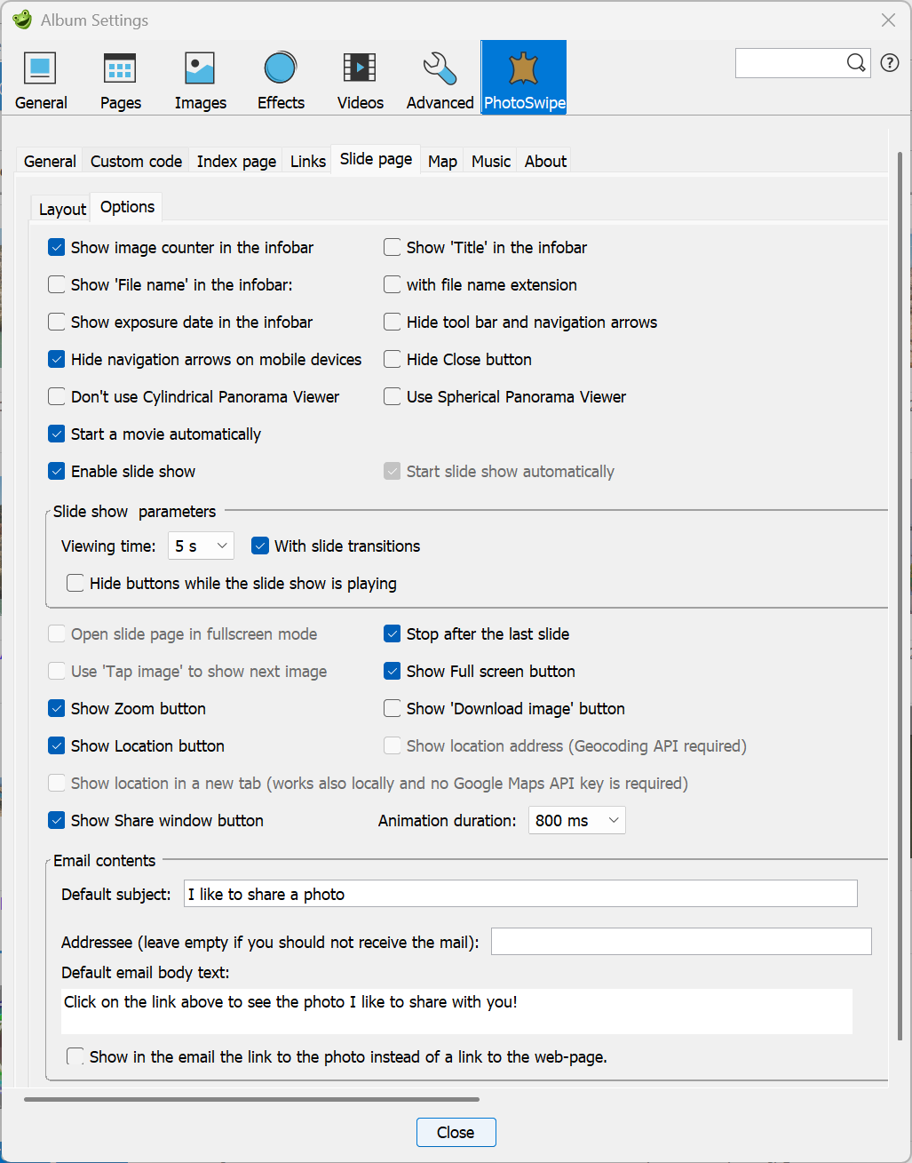
If check-mark 'Show image counter in the infobar' is set, the default PhotoSwipe counter information is showed, like '2/5'.
Other items you can display in the infobar are the title, the file name with or without the file name extension or if
check-box 'Show exposure date in the infobar' is set, the exposure date of an image or recording date of a video date will be displayed.
See the Portfolio album for an example.
The format of the exposure date depends on the contents of the Date format field of the Advanced / General settings tab,
for instance in the Portfolio album
I used this format: 'Recorded: 'dd-MM-yyyy.
It works for videos only with jAlbum version 22.0.3 or later
Check-marks 'Hide tool bar and navigation arrows' and 'Hide Close button' allows you to disable closing the slide page. It is advised to do this for embedded slide pages.
Default no navigations arrow buttons are showed on mobile devices which supports swiping, but if you clear check-mark 'Hide navigation arrows on mobile devices' they will become visible. This is sometimes useful if you use web-locations which are displayed in iframes.
If you are not going to use Cylindrical panorama viewers, it is advised to set check-mark 'Don't use Cylindrical Panoramic Viewer, to make the loading of the album faster. I that case all html code and extra libraries for panoramic images are removed from the created files. You can in that case still enlarge panoramas by clicking the zoom button; it is advised in that case to set check-mark 'Cylindrical panoramic image' in the 'Panoramic Image' user panel, which you see if you open the image in the Explorer.
If check-mark 'Use Spherical Panorama Viewer' is set, a spherical panorama viewer is opened in a special Spherical Panorama viewer if the 'Spherical panorama image' is set in the PhotoSwipe panel. Clear check-mark 'Use Spherical Panorama Viewer' if no spherical panorama pictures are used in the album, this makes the loading of the album faster.
A 'Play' button to start a slide show will be added to the tool-bar in the upper right corner if check-mark 'Enable slide show' is set.
If check-mark 'Start a movie automatically' is set, local movie files and audio-files dropped in the Explorer window, start playing automatically on a PC. On a mobile devices an automatic start is not always allowed by the operating system, so there the button might have no effect. For an iPhone it is recommended to check this check-mark. YouTube and Vimeo videos are not automatically started.
Select the default viewing time per slide, the viewer can change these value in the Viewer settings window.
If check-mark 'With slide transitions' has been checked, you see simple slide transitions if you select previous or next slide and during the slide show.
If check-mark 'Hide the buttons while the slide show is playing' is set, the buttons will disappear if the slide show starts.
Stop in this case the slide show by clicking somewhere outside the image, in which case the slide page is closed.
You can pause the slide show by clicking the space bar or by clicking in the image. Do this again to continue the slide show.
If check-mark 'Start a movie automatically' is set, the slide show is temporarily stopped while the movie plays. If the movie ends, the slide show is continued.
Clicking on a movie will not pause the slide show. The slide show stops if a web location is displayed.
If check-mark 'Hide the buttons while the slide show is playing' is cleared and you play a movie on a smart phone like an iPhone, these buttons are nevertheless hidden . To stop the video or continue after the movie is ready, click in the movie. You will see a screen like this:
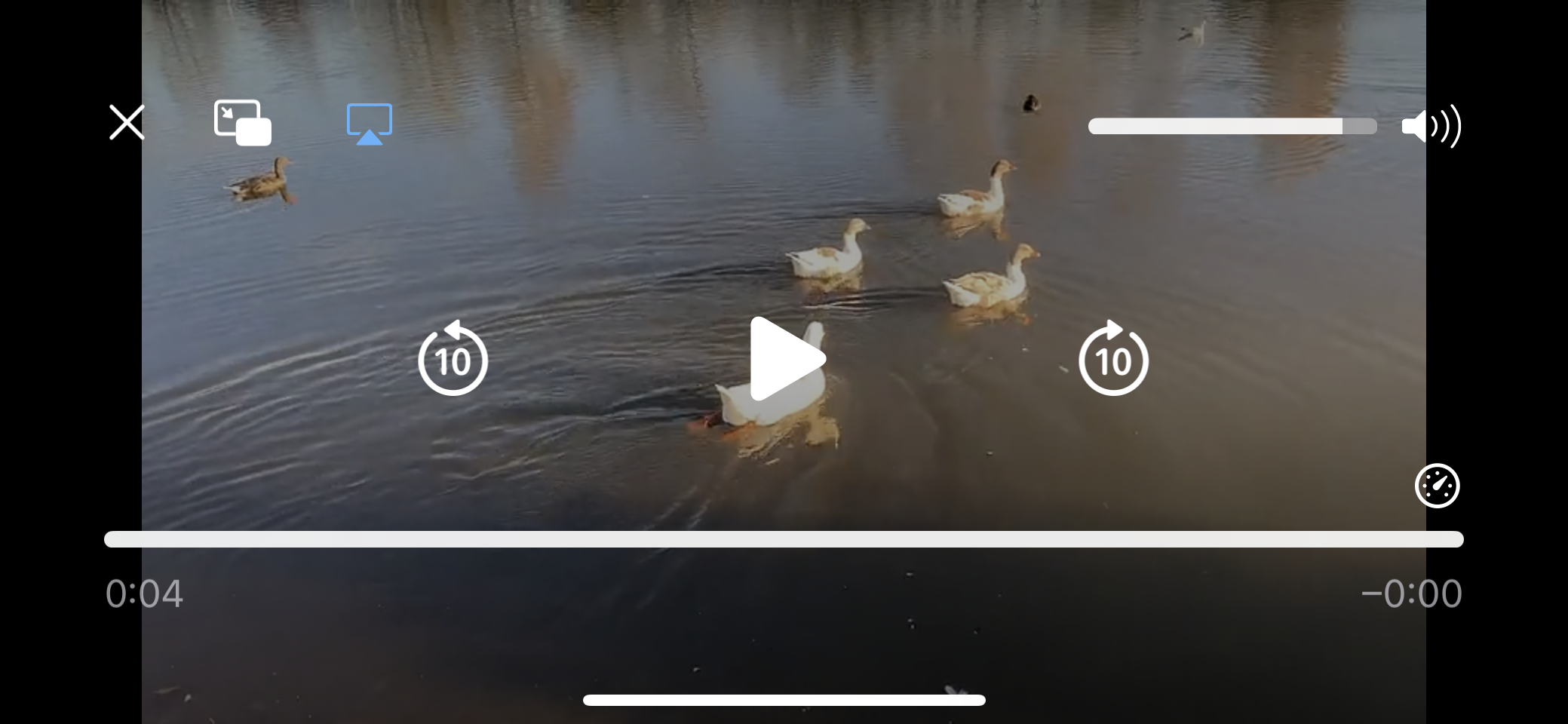
Click on the upper left X-button to show the toolbar and navigation buttons again.
Check-mark 'Start slide show automatically' is only used for embedded albums if check-mark 'Skip thumbnails pages'on the Skin settings – General tab is set.
Check-mark 'Open slide page in Full-screen mode' can only be set if check-mark 'Disable viewer settings' on the General tab has been set.
There are four ways to open the Light-box in full screen mode on devices which support full screen mode:
The slide show stops after the last picture or it can loop, depending on the check-mark 'Stop after the last slide'. If this check-mark is set, and the slide show is ready with the last slide, the slide page will be closed and the index page appears.
If check-mark 'Enable slide show' is cleared, you can set 'Use 'Tap image' to show next image' if you don't like to use that corresponding small button left and right of the image to do that.
If this check-mark is cleared, clicking in the slide image on a PC will zoom the image and on a mobile device it will toggle the toolbar.
This is done because on a PC it is not possible to zoom by double clicking in in image, what is possible on a mobile device.
Navigation to the next slide is also possible on a PC by using the space-key on the keyboard. You can always select the next/previous slide with swipes on mobile devices or with the arrow keys on a PC.
Notice that if you click in the area around the slide image, the light-box will be closed on a PC.
With version 5.6.3 tapping in the area around the slide image will also close the light-box on a mobile device.
If a the slide show is not started from the index page, you can start it by clicking the play button in the tool-bar or on a PC by the space bar key of the keyboard. Stop the slide show by clicking the Pause button in the tool-bar (if the slide show is not active, such a click will close the slide page) or by clicking somewhere outside the image or by clicking the space bar.
By setting check-mark 'Show full screen button', a Full screen button is displayed in the tool-bar. However it is recommended not to do that: better show a slide page always full screen via the corresponding setting on the viewers settings window or use the Full screen button on the index page. If check-mark 'Show full screen button' is set, the Full screen button on the index page is hidden.
If you like you can remove the default zoom button, by clearing check-mark 'Show Zoom button'.
If check-mark 'Show 'Download image' button' is set, a 'Download image' button is added to the tool-bar in the upper right corner. Which quality is used for the downloaded image depends on the Album Settings - Pages.
You can also select setting 'Link to originals' for instance if you process RAW images in for example Lightroom 6. Export in that case 3840x2160 images to the jAlbum image directory, select 'Link to originals', 'Copy originals as needed' and 'Make images look sharper on HDPI displays' and make the album. The slides directory stays empty in this case.
If you set check-mark 'Show location button', a Google Maps icon is displayed in the upper right corner, Clicking this icon will show in a Google Maps window where the picture or video is exposed. For a Video you can add a GPS location manually or with a GPS tool or you can add user variable gpsLocation by hand like: gpsLocation=+52.2530,+6.1657 This requires a valid Google Maps API key on the 'Map' tab, unless check-mark 'Use OpenStreeMap' has been selected.
If you set check-box 'Show location in a new tab', and you click the location button above a slide, Google Maps shows a map with the location in a new tab. No Google Maps API key is required if you use this location display option.
If you like to see the address information above the marker, set check-mark 'Show location address (Geocoding API required)'
To share a slide page, use check-mark: 'Show Share window button'. If set, the slide page shows a Share button to open a modal window with maximal 5 share buttons for WhatsApp, Facebook, Twitter, Pinterest or Email (WhatsApp only on mobile phones). If the viewer clicks on that button, the image will be uploaded to the selected medium.
For sharing a slide page, an unique link is generated for each slide page no matter how you sort the images.
It has the same format as used by the Tiger skin, like 'album_dir/#img=Vecht_121027'
You will not see this format in the URL field of the browser, there you still see the format 'album_dir/#?M3',
but if you put a new image before the shared image and you enter the shared URL 'album_dir/#img=Vecht_121027' in the UL field of the browser,
the same shared image will be displayed.
The clipboard contains a link to this image and a link to the corresponding slide web-page and to a possible title, so use the key combination Ctrl+V in the description area if you like to include a link to the slide page.
The combo-box 'Animation duration' defines the duration of the zoom-animation you see if you open and close the lightbox.
Just as on the index page, you can start an email on the slide page: by checking check-mark 'Show Share window button'. For more details see above. If you set check-mark 'Show in email link to photo instead of link to the web-page' in the 'Email contents' group, the URL of the picture will be showed in the email body text.
The photo or video location can be displayed if the 'Show location' check-box is set and the Photo or Video does contain GPS information. If check-mark 'OpenStreetMap' is checked, it is displayed in OpenStreetMap. If that check-mark is cleared, the lication is displayed in Google Maps. Each user of the Google Maps server should have his own key as is explained in this jAlbum message. This key is used in the album code, so it is part of the skin parameters and it can be entered in the Map tab:
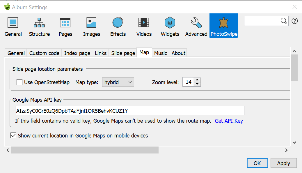
You can get a key here, but before you ask a key, you should create a Google account, if you don't have that already. If you leave this field empty or if you enter a invalid key, you will see the message 'Geocoder failed due to: REQUEST_DENIED' is you try to show the location of slide page. If you create a key, it is important that you enable the Geocoding API as explained here.
This key is also required if you show the route in Google Maps via link 3 on the Links tab and you selects as URL a kml or kmz file.
As you see above, the Map tab allows you also define the Map type to be used if Google Maps is used (both for the slide location and the route) and the zoom level (1-20, value 1 shows the whole world and level 20 shows buildings). The zoom level is only used if you display the slide location.
If the Google Maps API key is empty, you can still show the location of a slide image, but in that case is the location showed in a new tab. However a route can't be displayed in Google Maps that case, however you can also display the route in OpenStreetMap with program MakeMap.
If check-box 'Show current location in Google Maps on mobile devices' has been checked, the current location can be displayed as a blue circle in a Google Maps map on a mobile device. More information in this note.
Note that the geographic location of a user will only display if he or she has allowed location sharing, so for example: if you use the Safari browser on an iPhone, you should open 'Settings' and select the 'Privacy and security' and next the 'Location Services' and check that for 'Safari-sites' check-mark 'When using app' is checked.
If you display a route track in a FancyBox album and you open that track with the Google Maps button on the index page, the current location will be updated each 5 seconds, so you can now follow the route on the map: move in such a way that the blue circle coincides with the track as you see here in the left screen shot.:
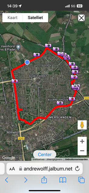
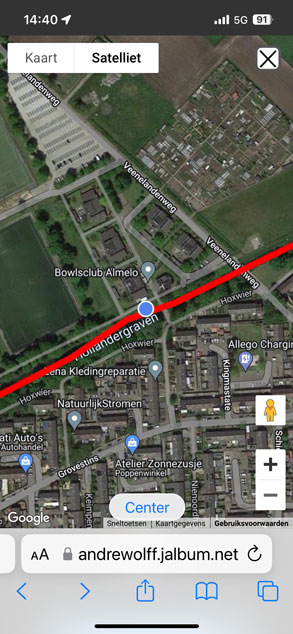
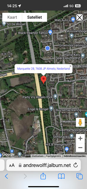
On the bottom you see a 'Center' button, which can be used to center the current
location in the map, see the middle screen shot. The '+' button is used to zoom-in.'
Note however if the current location is far away from the displayed track,
the track may move out of the window.
Use the '-' button or your two fingers in that case to zoom-out and/or pan to make both items visible
in the window or close the window and click again the Google Maps button to restore
the original display of the track.
The right screen shot shows the current location if you click the location button of a slide page; here is no 'Center' button displayed and the position is not updated after 5 seconds.
To play music in a slide show you can chose to play one track with the html5 audio player on the 'Music' settings tab:
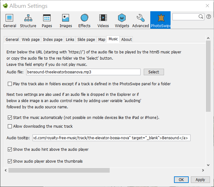
Enter here the URL of the ogg- or mp3-track or copy the audio file to the res folder by clicking the 'Select' button and browsing to the ogg or mp3 file you like to use. You can play that audio file on the server, but not on the local PC with the Internet Explorer and also not with the jAlbum preview function. The html5 player is supported by the latest browser versions of Internet Explorer, Edge, Google Chrome (both on a PC and on an Android tablet), FireFox and Safari (both on a PC and on an Apple iPhone or iPad).
If the check-box 'Play this track also in folders except if a track is defined in the PhotoSwipe panel for a folder' is set and you use this in an album with folders, the music stops if a (another) folder album is opened and the same track can be started in the newly opened folder.
The next two check-marks are also used for the last two audio sources:
Check the check-box 'Start the music automatically ...' if the music should start automatically on a PC.
Check the check-box 'Allow downloading the music tracks' if you allow users to download a music track on a PC. If set, the track can be downloaded by clicking with the left mouse button on the 3 vertical dots in the audio controller and by clicking next on the download text in the pop-up menu. This works on a Windows system with the Google Chrome and Edge browser.
With text-box 'Audio tool-tip' it is possible to show the music name and possible copyright in a tool-tip.
If check-mark 'Show the audio hint above the audio player' is set this text is not showed as tooltip but as a text above the audio control.
If check-mark 'Show audio player above the thumbnails' is set, the audio player is not displayed at the end of the index page,
but just before the thumbnails, so that the audio player is visible mostly if you open the index page.
This is convenient on mobile devices, where music cannot be started automatically, so you should in that case always click the play button of the audio player.
If this check-mark is set, the space before or after the audio player may, depending on the selected page options, be too large or too small.
This can be corrected by simple css code in the 'Custom code' css code box like:
#audioplayer {
margin-top: -20px;
margin-bottom: 10px;
}
If you have an album without folders, you should define the track here, but for albums with folders the track stops if you select another folder album, so we introduced more methods to play background music:
There are 4 methods to play background music:
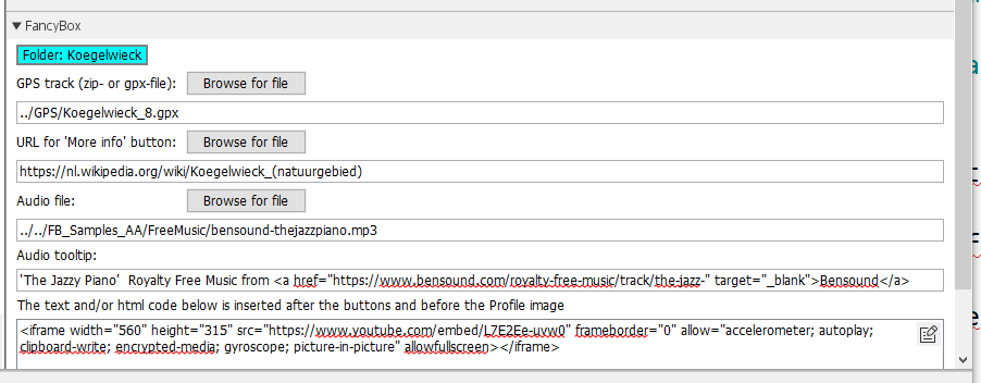
It is possible to link an audio track to an image, see this jukebox album. To implement this, save the audio file (type mp3, m4a, aac, flac or any other audio format supported by your browser) in the output folder (the folder with the index.htm(l) file of the (folder-) album) and open the image in the Explorer, click at the right side on the text variables and add a user variable audioImg with in the next box the URL or filename of the audio track, for example DeMeenth.m4a. This will display an audio control above the description of the image.
See here how that works. With user variable audioHint you can define a hint to be displayed if you hover the mouse over an audio control.It is also possible to make an album with only music tracks, see this example of a music tracks album. Save the MP3-files in the image directory with the Internet Explorer and make the album.
In most text boxes, like the Album description, you can use normal text or HTML code. If such a text field contains no <p> or <br> or any other HTML-tag, the line-feeds will automatically be replaced by HTML new-line tags (<br>).
You can use too simple HTML code like <br> to generate new lines, <b> and </b> around text to make it bold and <i> and </i> around text to make it italic.
If you do not use any HTML-tag, line-feed characters are automatically replaced by <br> tags.
In jAlbum version 21 you can also use a new HTML editor to format text, but that is not always correctly working if your text contains already html-tags, so do not to use that editor. In jAlbum version 22 is an other HTML editor implemented which works much better, so upgrade to version 22 or later version before you use the jAlbum HTML editor..
Default most of these text blocks are center-aligned, but if the text box has a check-box 'Use left-aligned text' and you check that check-box, the text will left aligned.
The jAlbum HTML editor assumes that the default alignment of text is left-aligned. As a result, text entered in the HTML editor is shown left-aligned in the editor window,
but after you made the album with the new entered text, you see the new text as center-aligned.
You can prevent that by checking this check-mark or by clicking the left-align button in the HTML editor if you start with a new text.
The HTML editor can be used in the About, About Album, Music and Empty Page template files and also for the Skin InfoWindow and Footer fields (requires jAlbum 22).
In most text boxes, like the Album description, you can use normal text or HTML code. If such a text field contains no <p> or <br> or any other HTML-tag, the line-feeds will automatically be replaced by HTML new-line tags (<br>).
You can use too simple HTML code like <br> to generate new lines, <b> and </b> around text to make it bold and <i> and </i> around text to make it italic.
If you do not use any HTML-tag, line-feed characters are automatically replaced by <br> tags.
In jAlbum version 21 you can also use a new HTML editor to format text, but that is not always correctly working if your text contains already html-tags, so do not to use that editor. In jAlbum version 22 is an other HTML editor implemented which works much better, so upgrade to version 22 or later version before you use the jAlbum HTML editor..
Default most of these text blocks are center-aligned, but if the text box has a check-box 'Use left-aligned text' and you check that check-box, the text will left aligned.
The jAlbum HTML editor assumes that the default alignment of text is left-aligned. As a result, text entered in the HTML editor is shown left-aligned in the editor window,
but after you made the album with the new entered text, you see the new text as center-aligned.
You can prevent that by checking this check-mark or by clicking the left-align button in the HTML editor if you start with a new text.
The HTML editor can be used in the About, About Album, Music and Empty Page template files and also for the Skin InfoWindow and Footer fields.
See this PhotoSwipe album for some examples. If you drop a PDF-file in the Explorer window, you will see the standard Adobe PDF reader icon (thumbnail 8 in the album). Add a pdf-file via web location if you like to use your own thumbnail (thumbnail 9 in the album) or like to see the updates of the file in the source location. If a weblocation is used, don't click on the 'Update' button after the 'Target URL' text-box (see this problem report); add your own thumbnail in the 'Image URL' text-box.
To make a thumbnail image for a PDF-file weblocation, open that file in a web browser and make a screen-dump to create a thumbnail for the web location. Save the screen-dump in the output folder and select that image via the browse button after the Image URL field.
Because a long PDF-file is not always readable to the end on an iOS device like an iPad, enter in the comment field below the image a link to your local PDF-file or if a weblocation is used, a link to the original PDF URL.
You can also use a PDF-file as Info window or open a PDF-file via a button on the index page.
jAlbum converts all video formats automatically to mp4 format which is supported on the iPad and most other devices. Both skins plays videos only in the browser and Flash is not supported.
Movies can be combined with photos in a slide show with both skins.
If a movie is loaded the slide show in stops and the movie starts automatically, except on the iPad or iPhone and other mobile devices where you have to start the movie by clicking the play arrow button. If the album is on a server, the next slide or movie is automatically started if a movie finishes playing. If you test this locally on a PC this works only with the Safari browser. With Chrome and the Internet Explorer, you should start in the local preview test the next slide/move by clicking the next button. Firefox plays no movies locally. Internet Explorer plays locally no mp4 movies. But if the album has been uploaded to the server it works fine with the latest version of these browsers, even with Firefox.
Multilingual text is supported. Currently there are text files for the following country codes: DE, EN, ES, FR, IT, NL and SV. However only the Dutch-NL and English-EN text.properties file is complete. The other languages are copied from the old slide show 2 skin, so you will see for newer items the English name. If you like to have your language file updated in a new version, send me a mail with the language file enclosed.
The following optional include files are supported:
I use mostly only these files:
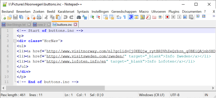
To prevent that the Google search engine indexes your album and links, add file page-header_all.inc to the image directory with contents:
<div><meta name="robots" content="noindex,nofollow">
All these include files do work only for the index file in the corresponding output directory, except for files page-header_all.inc and page-footer_all.inc which works also for index files in the descendant folders, see here for an album where one page-footer_0.inc file, one page-footer_all.inc file, one page-header_all file and several page-header_2.inc files are used.
With .inc files it is possible to add AddThis tools for links to social sites:
To implement AddThis floating Share buttons insert the javascript code before the </body> tag by inserting the code in file page-footer_00.inc .
It is possible with a check-mark on the Index page / General tab to move the help button to the settings window. You get in that case more room for other buttons.
If you require a special inc page for a specific album, put the inc file in the images directory of that album. If you like to use an inc file for all your albums, put the inc file in the root directory.
To add a search text box with a search button open the freefind website, enter the website of your album and add the other required data. Next select the Build Index tab and click the Index now link. If the building of the index is ready, you will get an e-mail.
To get the required code to your album open the HTML tab, select the search box layout of your choice and get the html code. Next add that code to the top index page of your album. I use the most simple search box, but use On page results, so I add also the extra javascript code.
I did remove the table tags in the fetched html code, translated the search button text in Dutch and saved the result for in file buttons.inc in the root image directory of the album:
<!-- Start of buttons.inc-->
<!-- start of freefind search box html -->
<form style="margin:0px; margin-top:-40px;" action="https://search.freefind.com/find.html" method="get" accept-charset="utf-8" target="_self">
<input type="hidden" name="si" value="your_side_id">
<input type="hidden" name="pid" value="r">
<input type="hidden" name="n" value="0">
<input type="hidden" name="_charset_" value="">
<input type="hidden" name="bcd" value="÷">
<input style="font-size: 20px;" type="text" name="query" size="20">
<input style="font-size: 20px; cursor:pointer;" type="submit" value="zoek">
</form>
<script src="//inc.freefind.com/inc/ffse-overlay.min.js" async></script>
<!-- end of freefind search box html -->script src="//inc.freefind.com/inc/ffse-overlay.min.js" async></script>
<!-- End of buttons.inc-->
You could enter this code also in the Skin settings – Index page / Footer html code text box.
You can see the result in my Pieterpad album.
I did customize the search page: I did remove the site map which for unknown reasons does not contain useful information for jAlbum folder albums. I changed also the background and text color of the search window., so that it looks more like an album page.
Things to know:
<!-- Start of page-header_0.inc -->
<style>
body {
background-color: rgba(230,212,186,1.0);
color: #000000;
}
#title_in_image {
color: #FFFFFF; /* White title in theme image */
}
</style>
<!-- Start of page-header_0.inc -->
The 3 numbers in the background-color code correspond with the first 3 numbers of the RGB tab of the color selector.
With the last number you can change the transparency of the background.
The text color is defined by the color code. In this example black, you can find the code in the last text box of the RGB tab of the color selector.
With he #title_in_image block you can override the properties of the title in the theme image.
With the next page-header_0.inc file you can change the background image of a particular folder album:
<!-- Start of page-header_0.inc -->
<style>
html, body {
height: 100%;
background-image:url(Lucht_060203_46.JPG);
background-position:center top;
background-repeat:repeat;
}
</style>
<!-- Start of page-header_0.inc -->
In this example I use a file Lucht_060203_46.JPG for the background which I saved in the corresponding output folder.
In the Google Play Store and the Apple App store you can find the Street View app which makes it possible to make 360° spherical panoramas with a smart phone.
You can view the resulting panorama in your browser or in the Street View app, but you can also view such a panorama in the light-box of the skins described here.
To implement such a panorama in an album you need the URL of the Street View panorama. The easiest way to get that URL is to click the Share button of the panorama image in the app and sent an email with the URL to yourself.
With the PhotoSwipe skin, the web location will be displayed in an iframe. In that case, before you enter this URL in the Target URL field of the web location, you have to change the link for use in an iframe:
You can find the recipe in the Google Streetview API documentation here.
The correct code is:
https://www.google.com/maps/embed/v1/streetview
?key=YOUR_API_KEY
&location=52.4085984,6.897875
&heading=210
&pitch=10
&fov=35
So you have two things to change in the web location URL constructed from the direct link:
If there are more Street View panoramas in the area selected by your location, this may give the wrong panorama. In that case it is better to use the panorama id: 'https://www.google.com/maps/embed/v1/streetview/?key=YOUR_API_KEY&pano=YOUR_PANO_ID'.
To get the panorama id, open istreetview.com and click the 'Load a panorama' button. Copy the URL in the text-box and click the 'Load' button. The selected panorama opens in the right pane were you see also the Panorama id displayed. Click on the paper clip to copy the panorama id to the clipboard and insert '&pano=' followed by your panorama id after the api key.
Instead of displaying your panorama as web location, you can also display the street view panorama in the spherical panorama viewer. Therefore you have to download the panorama image from the Google server.
How to do this has been described in this blog. Don't forget to set for the downloaded image the 'Spherical panorama image' check-mark in the 'Panoramic image' panel and the first check-mark in the '360°' panel.
To see both methods, open this Google Street view test album. Sadly enough the key used in this example is no longer valid .
You can also set check mark 'This is an album of albums' and use the original URL of the Street View panorama, see here for an example. The only disadvantage of this method the absence of a button to return to the index page with thumbnails; to return to the index page., use the return button of the browser.
The Marzipano viewer is an alternative for the interactive Photo Sphere Viewer of Jérémy Heleine which is standard used in my skins. The Marzipano viewer uses an image not made by the jAlbum program. The Marzipano viewer is displayed in an iframe and gives a better image at the south- and north-pole of the image.
To create such an image, open the Marzipano Tool page and click on the 'Start' button. Next click the 'Select files' button on the 'Add some panoramas' and select the image you like to process. After this selection you see:
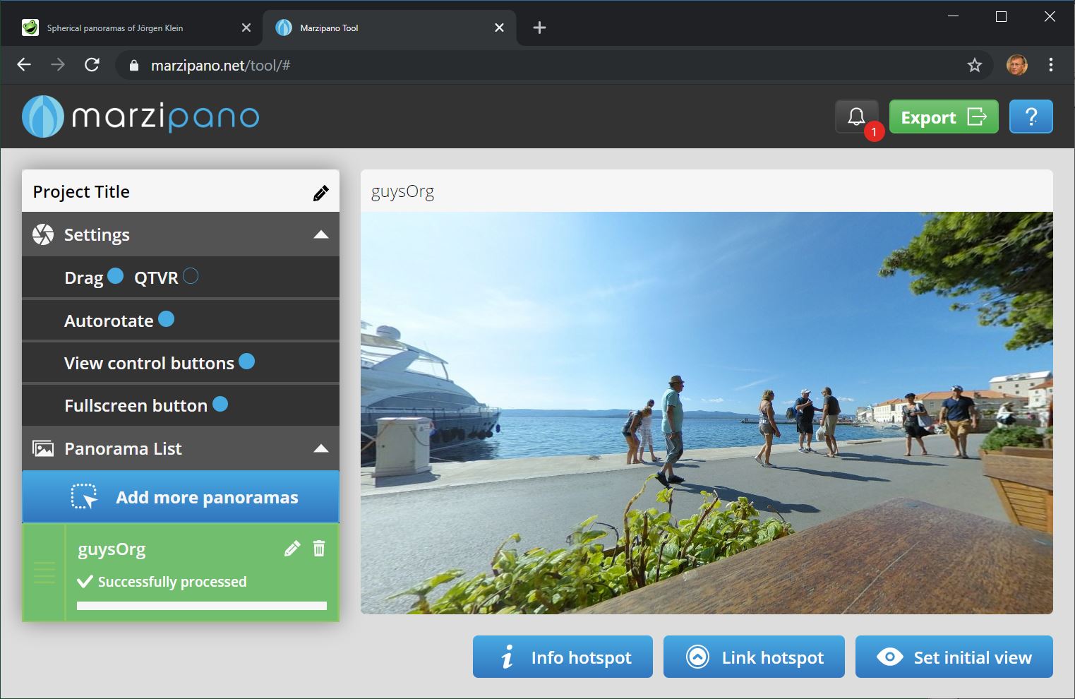
If you use large images like 2560x1440 HDPI images for your big monitor or TV screen, it may take a long time to see this images displayed on your smart phone, because the image are far too large for your phone and may be you have to pay too much to your network provider.
The solution is to a create a 2nd album with smaller images in such a way that the main album switches automatically to the 2nd album if it detects that the target device is small. This is possible if you insert this type of code:
<script>
if (screen.width < 500) {
window.location = absolutePath.replace("/Algarve/", "/Algarve_S/");
};
</script>
into the HEAD section of your main album which is used for large screens. Javascript variable absolutePath is in version 3.5.1 inserted in the top of the <head> section. It gives the URL of the (folder-) album. You can do this by inserting this code in the 2nd text box on the Skin settings – Custom code.
For a simple new album without extra files, you can follow the procedure I described on the jAlbum forum.
However if your album contains a number of manually added files like GPS-tracks, Map files or height profiles, you better follow the procedure described here.
I will describe the procedure I used to make a special album for small devices of my large Algarve album.
First I copied my existing album ../FotoSerie/Algarve/ to a new folder /FotoSerie/Algarve_S/
Next I opened the main Algarve album which produces 2560x1440 images with file Algarve.jap in the images directory, changed the slide image bounds to 812x375 (iPhoneXR screen size) and I changed the output directory to the just created folder Algarve_S. That is mostly sufficient, but I changed a number of more things: I removed the Google Translate link and changed some back links to my Algarve site to use spatial page I made there for small mobile devices..
Next I clicked the jAlbum Make button to replace the big images in output folder Algarve_S by small images and uploaded the album to the ../FotoSerie/Algarve_S/ page on my server.
Finally I saved the project via save project settings as .. to file Algarve_S.jap in the images directory.
Next I opened the main album again, added the code given above in the HEAD field of the Web page tab and made and uploaded the main album.
To see the final result open my andrewolff.nl/FotoSerie/Algarve/ album, you will see that it opens on smart phones the andrewolff.nl/FotoSerie/Algarve_S/ album, also for the folder albums.
If you later adds another folder album to the main album, you should first update the main album. Next You do a Make of the phone album and after this is ready, you add also in the corresponding folder of the phone album the files you added to the main album, for instance a map.kml file. Next click again Make for the phone album and upload the result.
Program MakeMap is a program that can make a map.kml file to show in Google Earth and Google Maps the locations where the photos are made. It is possible to make links to the corresponding slide pages in the way-point windows.
You can download program Makemap from my software download page.
To read the on-line-help file click here.
Program EditPhotoInfo is a program which can extract the location information of a photo from a GPS track log file. It stores the coordinates into the EXIF data block of a photo, which enables the jAlbum program to show the location in Google Maps if the corresponding button in the upper left corner of a slide is clicked.
You can also make a map.kml file to show in Google Earth and Google Maps the locations where the photos are made. It is possible to make links to the corresponding slide pages in the way-point windows. You can do this now better with my program MakeMap.
The program can be used to add a description to a photo and save the description in the EXIF data block of the photo.
However due to a bug in Album version 14 for Windows, see here,
special characters like é and © are wrongly displayed in that version (no problem in version 13).
So it is recommended to use a program like Adobe Lightroom to do this.
To display these special characters correctly in version 14, add string '-Dfile.encoding=UTF-8' to the end of string 'Virtual Machine Parameters=' in file C:\Program Files\jAlbum\Jalbum.ini
This is no longer required in jAlbum version 20, provided you did set the xmp check-box on the Advanced / Metadata tab.
You can download program EditPhotoInfo from my software download page.
To read the on-line-help file click here.
In this note you can find a recipe for the whole procedure (in Dutch).